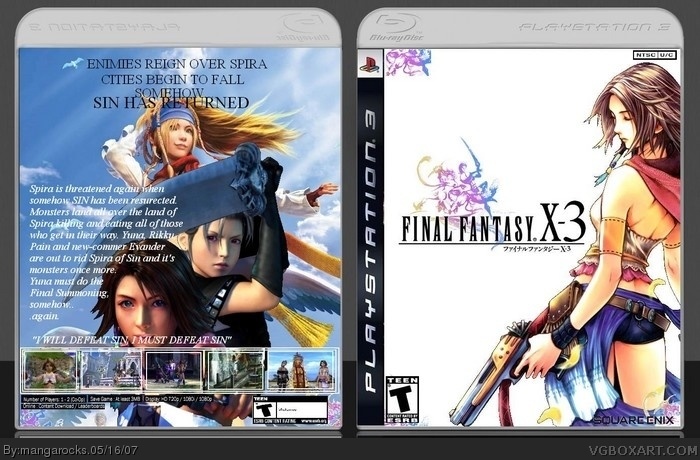
I know I said that im not making anymore Final Fantasy boxes but I couldn't find another game that I liked....It took me a while on the image on the back...I finally cut out the SE logo correctly and the front image isn't to plain...I had nothing to base the information on so I just made it up...what do you think?
What Feed said. Also everything is arranged unprofessionally, there should be copyright info on the back, the synopsis' test and Square Enix logo don't stand out well, the ESRB on the back is poorly proportioned, they shouldn't be an NTSC U/C logo on the front because PS3 boxes don't have them, the english on the back isn't great either and the images have pointless black lines that mean you didn't insert them properly. I think this is a poor box, also the template belongs to Wickedgamer1.
I recommend comparing your work more to real boxes to help you.
#6 what he said, i think this is a decent box and that pic on the front is from X-2 (or maybe X), and there are a few problems, but you've gotten a lot better.
the pictures are clear and the way the writings set out isn't bad.
The spelling mistake is a little disapointing, might have rushed it a bit.
but overall I like the way it was set out.
 Final Fantasy X-3 Box Cover Comments
I know I said that im not making anymore Final Fantasy boxes but I couldn't find another game that I liked....It took me a while on the image on the back...I finally cut out the SE logo correctly and the front image isn't to plain...I had nothing to base the information on so I just made it up...what do you think?
[ Reply ]
Oh and I forgot who made this box, please tell me who it was so that I can credit them!
[ Reply ]
well, i see spelling mistakes. "Enimies"?
[ Reply ]
and, stuffs are poorly cut out. srsly.
[ Reply ]
and...wtf is that in the upper left corner of the front?
[ Reply ]
What Feed said. Also everything is arranged unprofessionally, there should be copyright info on the back, the synopsis' test and Square Enix logo don't stand out well, the ESRB on the back is poorly proportioned, they shouldn't be an NTSC U/C logo on the front because PS3 boxes don't have them, the english on the back isn't great either and the images have pointless black lines that mean you didn't insert them properly. I think this is a poor box, also the template belongs to Wickedgamer1.
I recommend comparing your work more to real boxes to help you.
[ Reply ]
#6 what he said, i think this is a decent box and that pic on the front is from X-2 (or maybe X), and there are a few problems, but you've gotten a lot better.
[ Reply ]
i like it you just need to fix it up.
[ Reply ]
#7, i agree with him exactly.
[ Reply ]
Name reminds me of Porno. Final Fantasy X-3 -> Final Fantasy XXX!
[ Reply ]
the pictures are clear and the way the writings set out isn't bad.
The spelling mistake is a little disapointing, might have rushed it a bit.
but overall I like the way it was set out.
[ Reply ]
Its cool, But stuff isnt cut out right and its: Enemies!
[ Reply ]
#11, HAHAHA just noticed my spelling error...shit my bad im gonna fix it
[ Reply ]
Oh Yevon, no, not a third one!
[ Reply ]