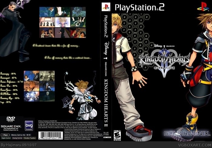
It's original and the resolution is good, but it's really flawed.
On the front, the ESRB rating is really small, the Square Enix logo is weird, it'd be better normal and you need the Buena Vista logo.
On the back the black gets a bit funny and the copyright info should be cut-out and over layed onto Sora, he is also misplaced. There's too many screen shots, boxes barely have any anyway near this amount, I think you need to redesign the back. You've messed up the bottom of the spine. There should be a NTSC U/C region logo somewhere as well.
This box has potential if you fix the errors, mainly because I quite like the design with Roxas and Sora, also the front needs a less plain background to go with the style of KH boxes. At the moment, this box is a bit of a mess, sorry if you think I'm overcritical, I'm just trying to help.
^^ its my first time doing this
But im rlly happy that i got allot of comments
Thx for helping me with the tips
About the advent children effect i rushed it because i was sleepy (yea i know rlly stupid) ill try to focus more next time ^^ again thx for the tips
 Kingdom Hearts II Box Cover Comments
It's original and the resolution is good, but it's really flawed.
On the front, the ESRB rating is really small, the Square Enix logo is weird, it'd be better normal and you need the Buena Vista logo.
On the back the black gets a bit funny and the copyright info should be cut-out and over layed onto Sora, he is also misplaced. There's too many screen shots, boxes barely have any anyway near this amount, I think you need to redesign the back. You've messed up the bottom of the spine. There should be a NTSC U/C region logo somewhere as well.
This box has potential if you fix the errors, mainly because I quite like the design with Roxas and Sora, also the front needs a less plain background to go with the style of KH boxes. At the moment, this box is a bit of a mess, sorry if you think I'm overcritical, I'm just trying to help.
[ Reply ]
wow good first but, the esrb is to small, back looks empty try adding a background, 3/5
[ Reply ]
The KHII logo should probably be a bit bigger as well and shouldn't have Japanese letters.
[ Reply ]
front = advent children effect :), but this is very flawed, i agree with all of what EG said.
[ Reply ]
^^ its my first time doing this
But im rlly happy that i got allot of comments
Thx for helping me with the tips
About the advent children effect i rushed it because i was sleepy (yea i know rlly stupid) ill try to focus more next time ^^ again thx for the tips
[ Reply ]
Welcome to the site Hajimaru. I'm glad you didn't take my criticism the wrong way like some new users would.
[ Reply ]
I rlly like the front, because it looks official. But the back needs a background.
this is 4000000 times better than my box.
[ Reply ]
haha!! your boxart rock!!
advent children
[ Reply ]
Thanks for ur comment ^^
[ Reply ]
Ah, i keep on loving it ;)
great comments ppl, keep it up.
GO HAJIMARU YAY xD
[ Reply ]