I guys ! I’m quite aware that it’s far from being one of my best works, but I’m not used anymore at working on boxarts so I guess it’ll take some time to get some of my skills back. I’ll try to improve on the next boxes.
 Jurassic World: Fallen Kingdom Box Cover Comments
Comment on Ulquiorra's Jurassic World: Fallen Kingdom Box Art / Cover.
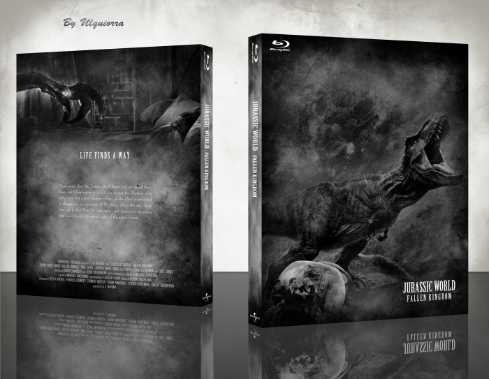
We all have projects we aren't proud of. I would't worry about it. My main complaint is actually the font for the synopsis. It's distorted look contrasts the clean fonts all throughout the design. Overall, it's pretty good. It reminds me of vintage horror films.
[ Reply ]
Thanks for the feedbacks. I'm glad it reminds you horror films because I think that some scenes of this movie are close to that vibe.
[ Reply ]
Definitely a good slipcase for sure, but I can see by looking at the front that you've used elements of different images and made it into one, and it's not easy to do. Black and white is usually the best method, and if anything, it fits the prehistoric theme brilliantly.
[ Reply ]
Thanks a lot! :D
[ Reply ]
No colour on an Ulquiorra box. Are you feeling ok? It is a great design though.
[ Reply ]
Ah ah thanks! yeah I'm alright don't worry
Also if you worry about colours just wait for the one I'll update tomorrow.
[ Reply ]
not bad. It is probable that I, too, will try to make a cover for this film..
[ Reply ]
Thanks for the feedbacks
[ Reply ]
the front looks good, but the back feels pretty empty and lacking by comparison, the tagline's a bit too small, the font used for the summary seems a bit unfitting and cheesy, although i get that you were trying to go for a more "horror" approach, but in terms of typography, fonts like these only work on taglines (and in the case of this one not even for that, sorry if i'm ragging on your font choice too much). i feel like a serif font could work better, slightly different to the one from the tagline but still somewhat fitting with the horror motif, maybe bodoni xt.
[ Reply ]
The contrast of this is lovely and the composition is great too.
But, I also agree with Frank for the most part. The tagline’s a bit too small and the typeface doesn’t quite work—however, I like the negative space and feel like this would work better as a steelbook, rather than a blu-ray box.
[ Reply ]
Thanks for the feedbacks guys! :D
[ Reply ]
fuck this :)))
[ Reply ]