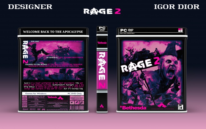
the logo originally planned to leave white but at the end of the work I still decided to make it pink it seems so better.though..
PS:I really liked the first part I will hope that this part will be even steeper..)
@Wolfenstein The Old Whatever you think is best in your own work dude, that's all that matters. The only reason I pointed the logo colour out is because, when I was studying design in College, I did a similar thing in a piece I made, and my tutor told me that even though it's a custom piece, if you were to translate that into an official thing, you wouldn't legally be allowed to change the colour of an already coloured and trademarked logo. But it's a custom cover so fuck it lol, good shit
I was a little disappointed when I saw that the front was the official, but ah well.
I've honestly checked out when it comes to following your designs, and even though I still wish that you would try something else, besides monochrome, the back is by far the best I have seen from you, so far.
I do think that the text for the bottom part clashes with the rest of the design, though. I would suggest a cleaner font, or just using the same one that you used all throughout the back.
 RAGE 2 Box Cover Comments
I dig it. Pink works quite well for the 'punk' style of the game.
[ Reply ]
I agree...
[ Reply ]
The black and pink style fits the game well, but I think the Bethesda logo on the front and spine would have been better white :)
[ Reply ]
the logo originally planned to leave white but at the end of the work I still decided to make it pink it seems so better.though..
PS:I really liked the first part I will hope that this part will be even steeper..)
[ Reply ]
@Wolfenstein The Old Whatever you think is best in your own work dude, that's all that matters. The only reason I pointed the logo colour out is because, when I was studying design in College, I did a similar thing in a piece I made, and my tutor told me that even though it's a custom piece, if you were to translate that into an official thing, you wouldn't legally be allowed to change the colour of an already coloured and trademarked logo. But it's a custom cover so fuck it lol, good shit
[ Reply ]
@BenBrownDesign I agree)))thanks
[ Reply ]
Nice
[ Reply ]
ok..
[ Reply ]
I was a little disappointed when I saw that the front was the official, but ah well.
I've honestly checked out when it comes to following your designs, and even though I still wish that you would try something else, besides monochrome, the back is by far the best I have seen from you, so far.
I do think that the text for the bottom part clashes with the rest of the design, though. I would suggest a cleaner font, or just using the same one that you used all throughout the back.
[ Reply ]
Thanks for the feedbacks) I will keep it in mind..
[ Reply ]