![]() »
»
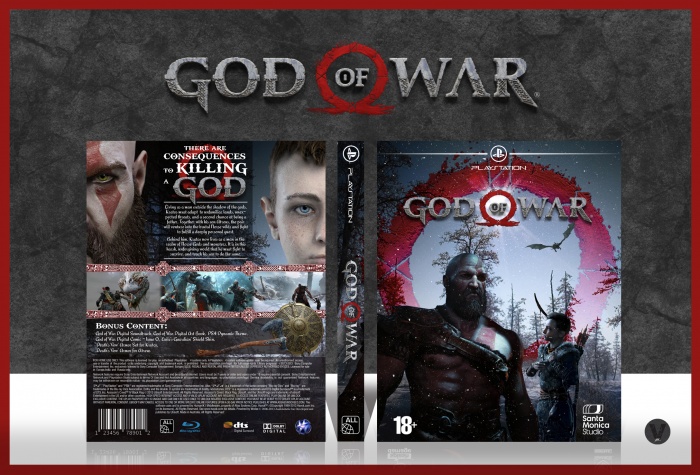
Another game I can't wait for. Was quite a challenge to come up with a good concept as there isn't much to use.
Hope you like the design.
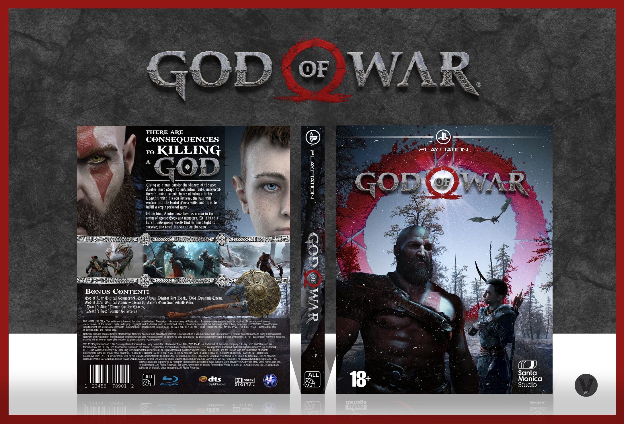
[ Box updated on January 29th, 2018 ] [ original ]
 God Of War Box Cover Comments
Comment on Vince_1990's God Of War Box Art / Cover.
Just noticed some errors so will be doing an update
[ Reply ]
idk if it's just me but the back seems a little unbalanced but that just might be because the render on the right is not at the same size as the one on the left, thus making the text box seem a bit uncentered, also i'm not entirely sure on the text being completely aligned to the right
front's pretty good, tho that kratos render might be a bit too dark imo but that's no biggie, good job working with the few resources out there
[ Reply ]
Thanks Frank, I see your point about the faces making the text seem off center. Would have to align the screenshots and stuff below off to the right and the text if I wanted to cheat it a bit...
I'll center the text in the box too and see if that helps. Thanks :)
[ Reply ]
not bad but I would have the text in the frame which you have on the screenshots quite a parsimonious image resolution what is the reason for this ???
[ Reply ]
Thanks for the suggestion. I'll give it a go on the update and see what I think. It's the same res as all my other cases. There isn't a whole lot of resources so was limited with what I can use, could be why...
[ Reply ]
Gorgeous just gorgeous specially front great job
[ Reply ]
Thanks Mo
[ Reply ]
This is pretty cool. The only thing I hate about it is the summary/description text. That is a very decorative font and it's hard to read at such a small scale. It works great as a headline font, but I'd consider changing the body text to something more legible (still a serif, to fit the style of the game though). Also, I think a bit more red needs to be added to the back to tie into the front. Maybe just those bars/lines holding the summary? Just a thought.
But yeah, the quality of this is great. I'm just nitpicky about details. Great job as always.
[ Reply ]
Thanks for the advice Lulu. Check back soon hopefully I would have updated it by then
[ Reply ]
nice dude ;)
[ Reply ]
Thanks Amin :)
[ Reply ]
Great job, Vince! Only one remark, is a bit heavy frame for the screenshots).
[ Reply ]
Yeah maybe, I couldn't find anything better that fits a Norse theme that would work well. Thanks though :)
[ Reply ]
Awesome box Vince! Only thing I have a problem with is the characters, especially Kratos, seem a little too dark on the front. Otherwise, this looks great
[ Reply ]
Thanks Steve
[ Reply ]
Like back
[ Reply ]
Like
[ Reply ]
Front little drak but this really nice work and i like it . . .
[ Reply ]
Thanks Matin
[ Reply ]
There are a few contrast errors along the front and back (they're not cohesive, I mean) and I so with "God" on the back was centered with "to Killing a" being on top of it but it's okay. It's well put together, the individual elements are just seemingly out-of-place.
Good to see work from you again, Vince.
[ Reply ]
Thanks man, I'll try and do better next time :)
[ Reply ]
I'm doubting hard whether or not to buy this one.
[ Reply ]
why not??
[ Reply ]
Get it get it get it. Something I found out recently, is the whole game is done in a single take. Like no cuts of the camera, no loading screens... Will be amazing
[ Reply ]
If that's the case, I'm sold!
[ Reply ]
Very nice. My son plays this game)))))))
[ Reply ]
It's a dope game, you should play it too
[ Reply ]
very very nice...
[ Reply ]
Thanks a lot man
[ Reply ]
had you ever designed any bad cover in your life? Thats dope
[ Reply ]
:D thanks bro
[ Reply ]
Awesome job, Vince.
Really glad to see the damn homepage change!
[ Reply ]
Hahaha cheers Ben. Hope you're doing well.
[ Reply ]
whao what the fuck the hof can change?
congrats btw i don't know how i never saw this one
[ Reply ]
Thanks man, it's actually changed twice. Once to my Ghost case too
[ Reply ]
@Vince_1990 wild
[ Reply ]
Damn, this website still somehow breathing. Congrats Vince! Got socials I can add you on btw? :)
[ Reply ]
My facebook is link
I don't really use social anymore, add me though cause I still have the messenger side of it.
[ Reply ]
New And Nice
[ Reply ]
Thanks
[ Reply ]