![]() »
»
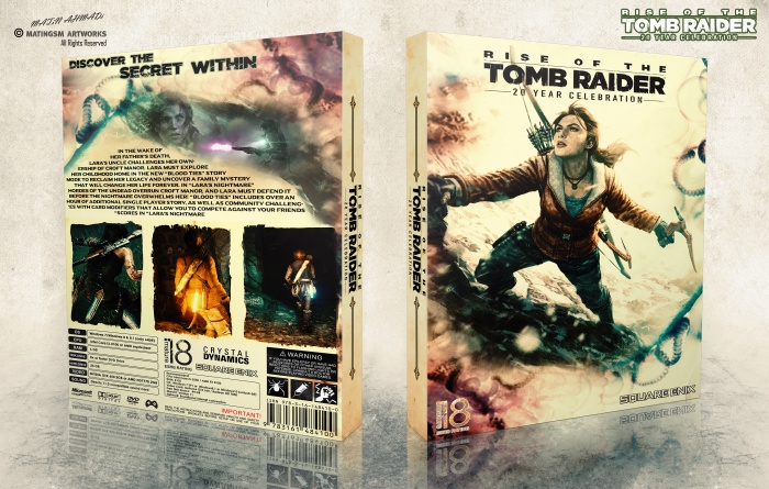
So. this is it, my new work, this one was a nice experience designing it, thanks to all my friends helped me finishing this,especially my friends Amin and Iman , I hope u all like it . . . .
Logo : link
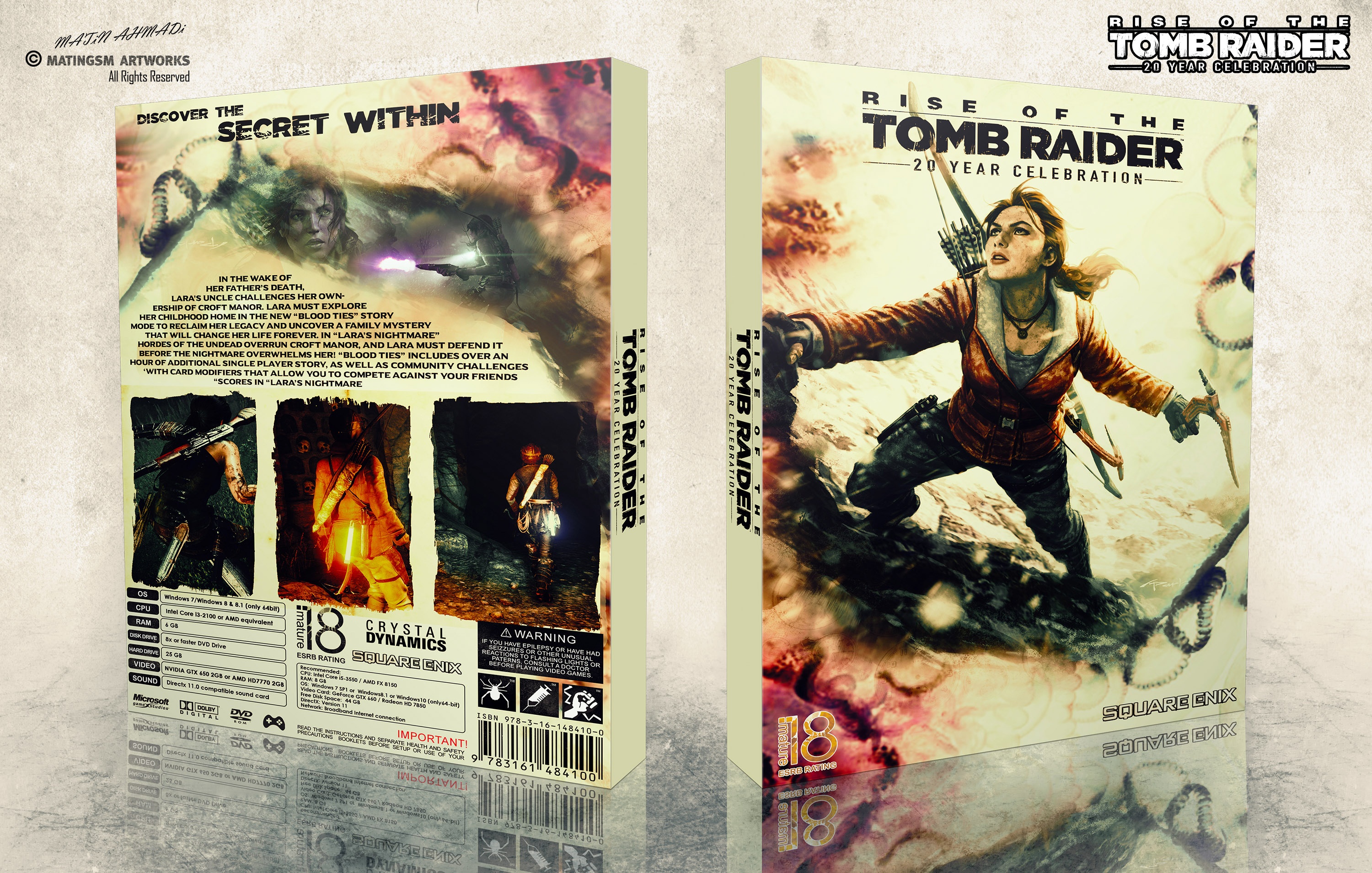
[ Box updated on June 5th, 2017 ] [ original ]
 Rise of the Tomb Raider: 20 Year Celebration Box Cover Comments
Comment on matingsm's Rise of the Tomb Raider: 20 Year Celebration Box Art / Cover.
really nice ;)
[ Reply ]
Thanks . . .
[ Reply ]
great work dude
[ Reply ]
Thanks dude . . .
[ Reply ]
Nice work brother
[ Reply ]
Thanks a lot bro . . .
[ Reply ]
Nicely done bro
[ Reply ]
Thanks bro . . .
[ Reply ]
Nice work ;)
[ Reply ]
Thanks Bro . . .
[ Reply ]
Peach Design
[ Reply ]
Thanks dude . . .
[ Reply ]
So awesome. I love the top of the back in the smoke, looks amazing.
[ Reply ]
Thanks a lot bro . . .
[ Reply ]
Not gonna lie, I don't think this is as good as your usual work. The yellow-ish filter doesn't work in my opinion, it looks like the cover was left in the sun for too long and everything has faded. As for the back, an all-caps font is usually a bad idea for a synopsis because it makes it harder to read. A regular font would be easier on the eyes and probably work much better. Finally, I think there should be a space between the screenshots and the legal text, having them touching just doesn't seem right.
Aside from that, it's a solid design, there's just a bunch of little things that could be improved here and there
[ Reply ]
:)
[ Reply ]
@matingsm completly agree :))
[ Reply ]
"an all-caps font is usually a bad idea for a synopsis because it makes it harder to read"
Basic knowledge not everyone gets after several attempts, I suppose :/
[ Reply ]
@Bastart First of all thank you for feedback, actually I feel your opinion like Excuses and blames til a Technical problem, you saying "Basic knowledge not everyone gets after several attempts, I suppose" and thats a insult to everyone who add this cover in thier favorite and I hope you don't feel like you have More Knowledge than everyone else.
[ Reply ]
@matingsm it's no blame, excuse or even an insult? and I never feel any better or wiser than anyone on here. It's just a common fact not to use capital letters for plain text, that's all.
[ Reply ]
I just tried to design on diffrent method of color (most covers have dark theme) I push new yellow color on it cuz I think it was original theme of the game, thank for comment box updated . . . :)
[ Reply ]
very nice cover bro , but after update fantastic ;)
[ Reply ]
@shiraziha Thanks bro . . .
[ Reply ]
Nice update matin there is no problem now
[ Reply ]
also really nice after update dude
[ Reply ]
Thanks dude . . .
[ Reply ]
Awesome work bro. . . . Keep working
[ Reply ]
Thanks bro . . .
[ Reply ]
I like the effects and the Andy Park artwork is a good choice for the cover. The alignment of the header looks better if centered or aligned to the left imo. the synopsis is all over the place (it looks quite chaotic to be honest, I'd suggest aligning it to one side and add some breathing room around it) I get the concept of the screens, but they feel a bit to static to be honest (I'd chosen a more dynamic set of screens, from in-game stills)
[ Reply ]
Well I feel there is no Technical problem into the cover and you didn't mean it. there is just a difference Taste here. every designer have their taste for their designs and they feel the idea they have and think about it and then start designing. I feel there is Enough space after update. it was my idea in screenshot to show three Different scenes of lara croft Instead gameplay screenshots.
all of this are difference Taste and there is no problem in having a Bad Taste for exmple in your opinion Resident Evil cover in main box are better than my design and you liked it but in my opinion that work are Scandal and worthless and I give 1/10 to it.
thanks for attention and good luck . . .
[ Reply ]
@matingsm You don't really have to clarify or even defend your design choices (after all, it's just an opinion/constructive criticism, do with it whatever you want with it) if you feel it looks technically etc. right, than I can't argue with that.
First you comment about me 'insulting' other people who faved your work and than you do the same thing by calling another user's work 'a scandal' and 'worthless'? Now, that's quite low.
I just fave whose cover I like, it's called personal taste (as you've already mentioned)
[ Reply ]
@Bastart yes I complatly agree with you no need to beliave and defend your desing and I never did that I just couldn't find any technically problem imo, I'm thankful cuz of your Criticism but sometimes any Criticism isn't right.
I have same technically feel about my design and others designs and I telling you that the way you Criticism everyone else designs look like you never had mistakes in your own designs and there isn't any technically problem and I'm not the only one who feel it, there is more designers who have same feeling about your comments but they shouldn't say it to you, but I telling it as your friend and respect you. there is problem in the way you criticism designs like I said before abot Resident Evil cover in main site you liked it, thats your choise and we haven't problem with it
it is about your taste and you didn't Criticism it even a single problem but when you come to mine and my friends covers which haven't any problem you tell a long story or problems and you don't like it, now user don't have to show your Inconsistency of Criticism ? isn't that Unilateral ?in your opinion Resident Evil cover haven't any problems ? let people judge it.
Anyway I told you in my first comment you insult to 23 person who faved my boxart without find out any problem and I'll keep telling that cuz thats a true.
in second comment I didn't insult to you or the other guy who designed RE cover I just gave you exmple about Different tastes and thats usual no problem.
you was the only one who faved that work among everyone in that website cuz they saw many problem of that boxart and It is not unlikely if some sick guys fave RE cover after what I told but what i am saying is Different and is that difference Taste and every taste is respectable
I just say the true I not try to blame everyone else design. thanks for comments and good luck . . .
[ Reply ]
Thanks dude.....
[ Reply ]
Love the front, but I don't like the all caps, strangely aligned text on the back.
[ Reply ]
. . .
[ Reply ]
I could have sworn I commented on this, but I guess not. Anyway, I like how the front turned out and am not so bothered by the yellow as others had mentioned. It's different, which isn't necessarily a bad thing. I, however, have issue with the text on the back. I'm aware that English isn't your native tongue so I am telling you that a chunk of text in all caps is very hard on the eyes. This (link) actually explains the reasoning behind it better than I can. Other than that, I don't really have any major issues with anything else. I like the treatment of the screenshots (the effect you have around the borders) and don't mind the header, minus the fact that's it's very close to the edge of the box (which you can just nudge a bit more down, honestly). But, besides these minor things I think it's a different take on a Tomb Raider box and I think the color scheme is interesting.
[ Reply ]
Anyway you commented now, like I said before I don't like to use repetitious theme for designing I try to make difference on my design. yes English isn't my native tongue and thanks for the link it is helpful for future boxs. thanks for comment lucid and good luck . . .
[ Reply ]
Thanks All Guys For Comment & Fav, You have so kind . . . :-D
[ Reply ]
Congrats Taxi ;)
[ Reply ]
congrats well deserved
[ Reply ]
Congrats Matin
[ Reply ]
#End: Thank you everyone for the comments & Fav & Watching And for the hall of fame . . .
[ Reply ]