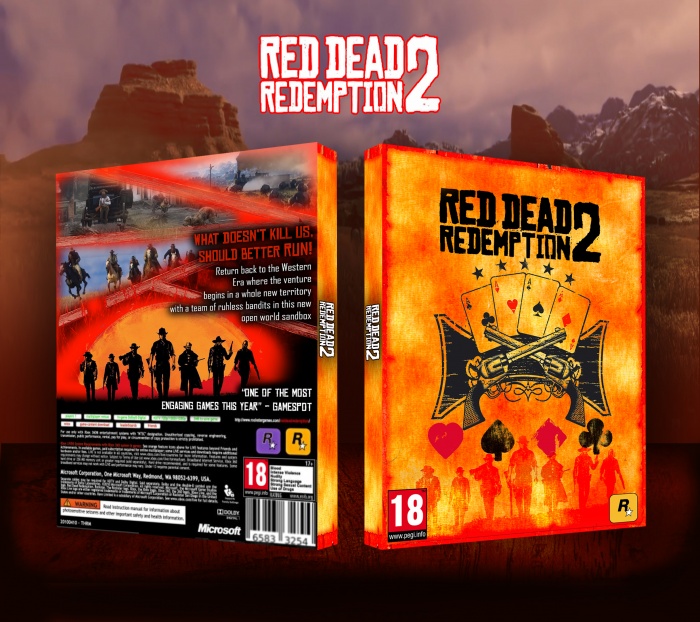
Getting excited for the release, I got screenshots from the RDR2 trailer and cropped out the title from the reveal picture. I also used a western Wanted poster to create the background.
[ Box updated on May 7th, 2017 ] [ original ]
 Red Dead Redemption 2 Box Cover Comments
Comment on GoldenCraig008's Red Dead Redemption 2 Box Art / Cover.
The front looks cool, but the back looks a bit sloppy and unfinished in my honest opinion.
I'd advice to choose a different font for the synopsis. I'd add a tagline and some borders to the screenshots and I'd suggest to play around with a different layout for the back.
[ Reply ]
The spine would also look better in red/yellow with a light paper-like texture, rather than the bland grey it is right now.
[ Reply ]
@Bastart thanks for the comments, i agree with what you've said and i will update this shortly. I'll definetely try more and add the changes you've suggested.
[ Reply ]
I agree, I also think it might be too bright overall. Looking forward to the update :)
[ Reply ]
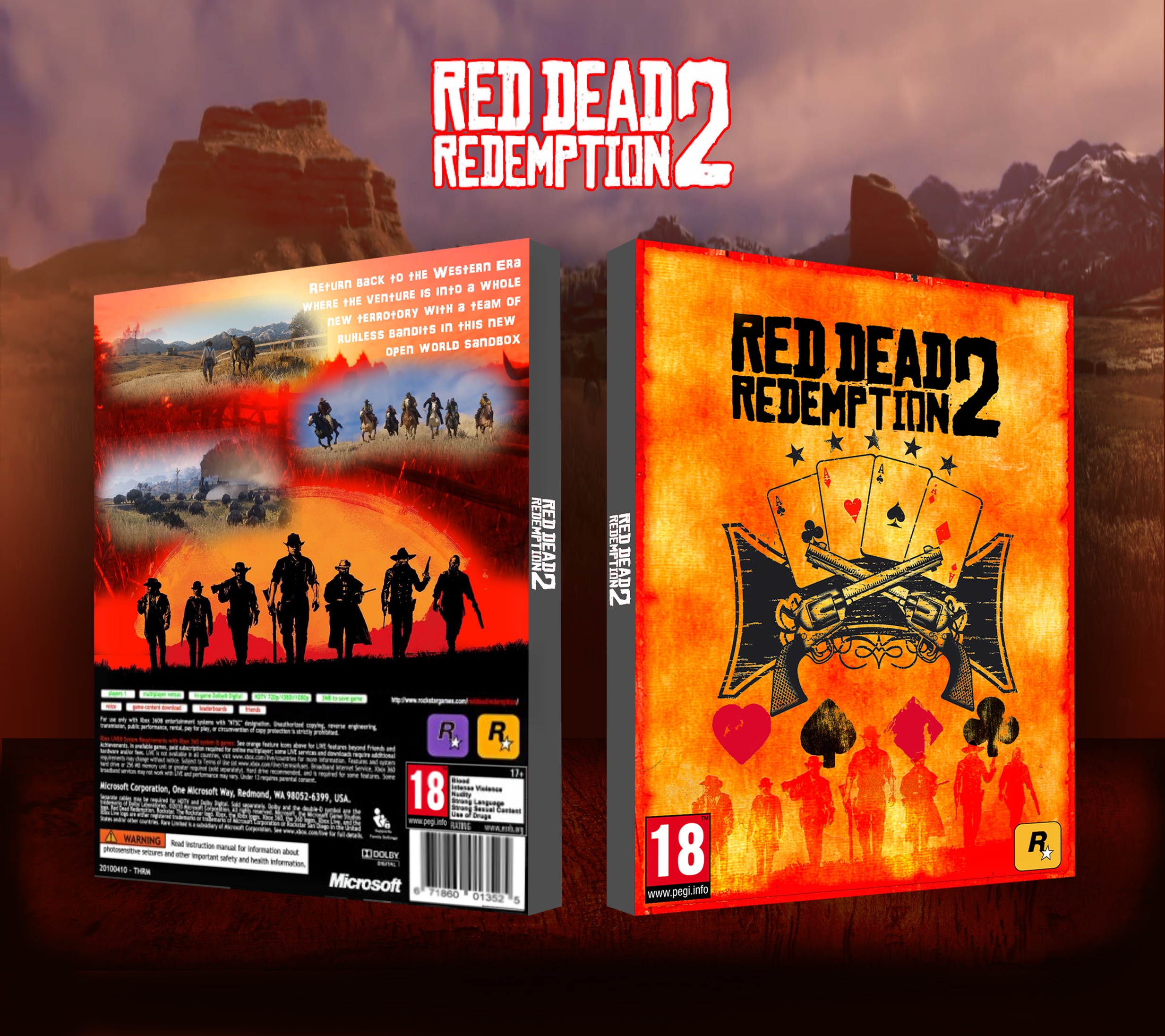
The update looks much better, but I still have some criticism:
- I don't really get the tagline?
- I'd suggest to make it a better understandable sentence (something like 'What doesn't Kills us, should better RUN!) than split it into two lines, look for a font more in line with the logo (some examples; link link the actual logo font (link or a variation link and move it above the synopsis.
- and finally I'd also move the top left screenshot more to the left or replace it with another image.
[ Reply ]
Alright thanks again. i'll try update it throughout the weekend.
[ Reply ]
@GoldenCraig008 It looks better, but the header could use a different color to distinguish itself from the synopsis and adjust the spacing between the lines (move them a bit closer to another) I'd suggest to use a simpler font for the synopsis, which isn't all caps. I guess I'm nitpicking and you already updated it so it would be a rather small change.
[ Reply ]
@Bastart I'd also suggest to put some kind of review quote or features info at the blank space in black (next to the cowboys illustration on the right bottom part of the back)
[ Reply ]