X Mohit 39 [ just now ]
It will look more effective in a appropriate presentation
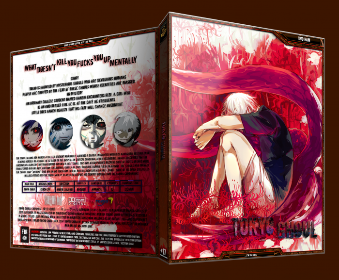
And that red stuff on the back is too dark when it comes to downwards of back and also the text on the back is looking distorted
When it comes to the front the logo is mixed up with the red stuff in the background of front.
Well overall it is not bad so keep it up...
 Tokyo Ghoul Box Cover Comments
Wha is i ???
[ Reply ]
X Mohit 39 [ just now ]
It will look more effective in a appropriate presentation
And that red stuff on the back is too dark when it comes to downwards of back and also the text on the back is looking distorted
When it comes to the front the logo is mixed up with the red stuff in the background of front.
Well overall it is not bad so keep it up...
[ Reply ]