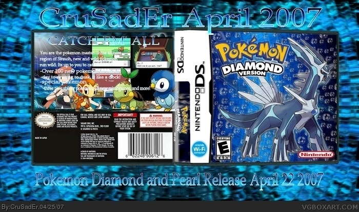
the pokemon on the back dont seem to be cut out very well...
your catch 'em all on the top is pretty unnoticable as well.
and your background is really distracting.
3.5/5
yeah Reeds right, actually GIVE credit. not just saying "you know who you are" . also, take away the background or darken it, and the box's back i can't read anythiing
I think you should take away the bubbles. It doesn't really fit "Pokemon Diamond," like it would "Pokemon Aqua Blue," that unreleased sequal to Firered and Leafgreen
 Pokemon Diamond Box Cover Comments
the pokemon on the back dont seem to be cut out very well...
your catch 'em all on the top is pretty unnoticable as well.
and your background is really distracting.
3.5/5
[ Reply ]
I like the front. I don't like the back because it has little to no organisation.
[ Reply ]
And if you want credit, you know who you are.
[ Reply ]
Also, what is with people and my backgrounds?
[ Reply ]
the background is just too flashy. the point is to focus on the box. not the background. your background is too bright and it take away attention.
[ Reply ]
#4, thats a stupidand unfair way of putting it...
#5, they take away from the box, which should be the focal point in the image.
[ Reply ]
7. thats what i just said you poser! xD
[ Reply ]
Fine.
[ Reply ]
i can barely read anything on the box
[ Reply ]
I actually like this one some cutting problems on the back though 4/5
[ Reply ]
#3, Sounds like someone wants another ban... Quit acting like an ass.
[ Reply ]
yeah Reeds right, actually GIVE credit. not just saying "you know who you are" . also, take away the background or darken it, and the box's back i can't read anythiing
[ Reply ]
I think you should take away the bubbles. It doesn't really fit "Pokemon Diamond," like it would "Pokemon Aqua Blue," that unreleased sequal to Firered and Leafgreen
[ Reply ]
I love the front, but on the Back, you can barely read the words, and they overlap the pictures.
[ Reply ]