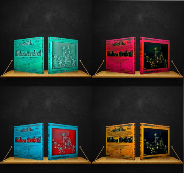
I've noticed a theme with all of your boxes where it looks like you have a really awesome design, then you ruin it by putting these color filters over it. This box (and your BF1 box) would look a million times better if you just stuck to one, color accurate box.
Again yes. The colours are abstract beyond belief for all of these bar the bottom right one. Stop posting multiple versions and just stick with the best one.
@Adhiboy Agreed. You're not spared if you put in effort if your final work doesn't look good. The colours look garish so try a more subtle colour scheme.
 Watch Dogs 2 Box Cover Comments
your feedback is important to me ... ))
[ Reply ]
I've noticed a theme with all of your boxes where it looks like you have a really awesome design, then you ruin it by putting these color filters over it. This box (and your BF1 box) would look a million times better if you just stuck to one, color accurate box.
[ Reply ]
Again yes. The colours are abstract beyond belief for all of these bar the bottom right one. Stop posting multiple versions and just stick with the best one.
[ Reply ]
Adhiboy
this is not just what filters are all done in hand-took me a long time to this effect so the rear ask my conscience does not allow me )
[ Reply ]
@Deadpool just because it takes effort doesn't mean it looks good.
[ Reply ]
@Adhiboy Agreed. You're not spared if you put in effort if your final work doesn't look good. The colours look garish so try a more subtle colour scheme.
[ Reply ]
your work @deadpool is bullshit
[ Reply ]