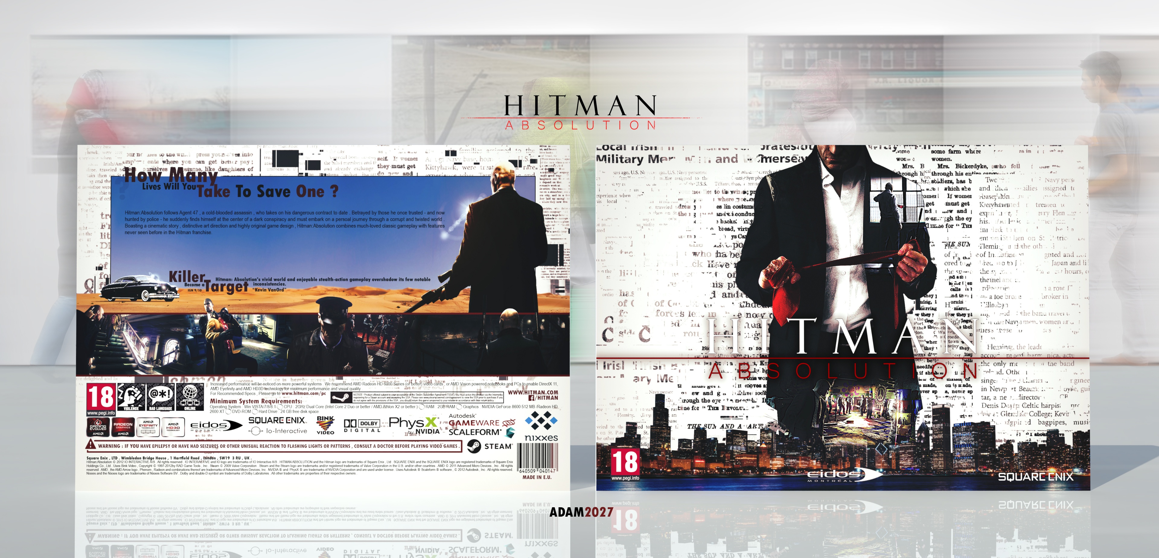
Tnx bro <3. I glade you like it. About back, (Ludwig Mies van der Rohe : less is more.) , but i agree with you. I try to make a better cover next time.
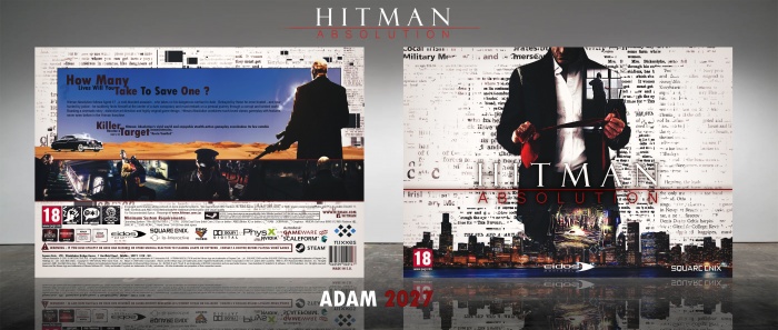
The front looks nice, the logo could stand out more though (a small black outline around the 'Hitman' part of the logo and a small white outline on the 'solution' part, could fix it)
The back looks fine, it's just the handling of the text that brings it down (the blank space around the text and the messy/weird placement of it) I'd suggest a better layout for the text.
Tnx for comment friend. About logo, I printed and see it,there is no problem with logo, you can easily see that.And, about back i`m trying to fix it ,but i don`t know how fix that.can you help me?
@Adam2027 Okay, but as far as I can see on my screen, the red is quite dark and the shadows on the logo look very weak :/
The back is quite easy to fix, just rearrange the taglines, synopsis and maybe make the font size slightly bigger? (so it looks less cluttered and it's easier to read) and move the text to fill up the blank space between the paragraphs.
 Hitman Absolution Box Cover Comments
The front is awesome!! But your back cover is lacking a bit..
[ Reply ]
Tnx bro <3. I glade you like it. About back, (Ludwig Mies van der Rohe : less is more.) , but i agree with you. I try to make a better cover next time.
[ Reply ]
The front looks nice, the logo could stand out more though (a small black outline around the 'Hitman' part of the logo and a small white outline on the 'solution' part, could fix it)
The back looks fine, it's just the handling of the text that brings it down (the blank space around the text and the messy/weird placement of it) I'd suggest a better layout for the text.
[ Reply ]
Tnx for comment friend. About logo, I printed and see it,there is no problem with logo, you can easily see that.And, about back i`m trying to fix it ,but i don`t know how fix that.can you help me?
[ Reply ]
@Adam2027 Okay, but as far as I can see on my screen, the red is quite dark and the shadows on the logo look very weak :/
The back is quite easy to fix, just rearrange the taglines, synopsis and maybe make the font size slightly bigger? (so it looks less cluttered and it's easier to read) and move the text to fill up the blank space between the paragraphs.
[ Reply ]
Nice Work My Friend
I Like It.
[ Reply ]