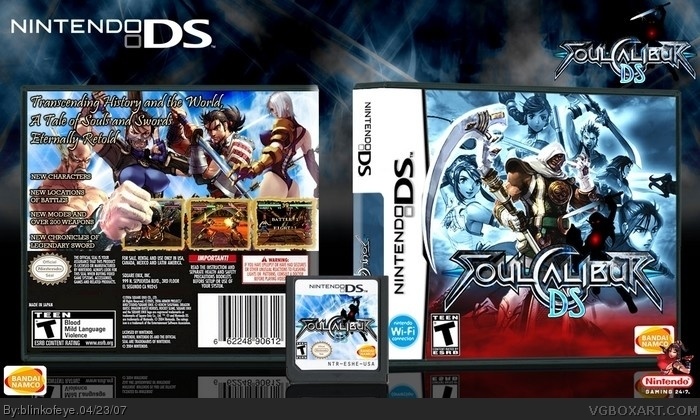
i donot know how many of you guys know but despite beining on college im also freelance designer, but latelly there is no much to do, looks like no body needs good logo or poster or web design..., im going to starv :( so im making boxes. What? oh yeah abot box. Well do you like it, do you like logo
If some of you are wondering yes that is Link, he is pleyable character in Game Cube version of Soul Calibur 2
really nice but the man on the back is hiding a little too much of the game screen and the game screen should be in two pictures on a DS but some game only use some screen so you got a 4.5/5 from me
Nice, I like it. Great vibe and a great color scheme! 5/5
Just stay in there, 'cause college life is a bitch, but rewarding, I know how it feel to be in the freelance field and I tell ya, I haven't yet got money for it. :D (logo, graphics for small companies, music for small companies....my website and animation are not part of my freelancing gigs...those are for myself and still working on them ;) )
(btw, try to spell checking next time, you writing looks kind of sloppy. ^_^)
#3, i should care for spelling, but i just dont, my spell-cheker underlines mistakes, but on every site i go there is "whatz bin upz pepl, ha r betchez" so i stoped caring, and also once i finish typing im to lazy, to change mistakes. And freelance sucks if you dont have money to advertise yourself, but i have to pay for college somehow
#4, there was a rumor that there was Soul Calibur for DS in working, it was remake of original SC
awesome. front is veryverehnice. the bottom a little heavy on the red, however.
also, your DS boxes are great, but to me they don't look very official... its probably because the backgrounds are very full and detailed and theres no actual summary, and text is big, just maybe look at some official boxes and keep that in mind for your next boxes. :]
Man! Looks very nice! Very professional design. I love the use of colors on the front! The white/blue work well and the red really breaks it up. Tho I do have some issues with it.
First off, the "DS" part of the front logo doesn't look like it matches up with the official SC logo.
The back, pic design part looks nice but the bottom, where the legal info is held looks like hell. It's blurred and obviously stretched in odd ways, it really distracts from the box.
Lastly, this is more of a personal question rather than a gripe against your design. Seeing as Heihachi is from Tekken, a series known to be only on the Playstation platform and only associated with SC because he was an extra in the PS2 version of SC2, does it make much sense to have him in a Nintendo title?
#11, ok yes, ds part sticks out but it was intentional so i added those lines on the side which have same color shame as "DS" part so that it fits better
and about template i will fix that in version 2.
about Heihachi i agree with you, but that picture looked so cool that i simply needed to include it, but if you think that it shouldn't be there it will also be changed in ver2 (you are SC fan right, cos i only make boxes based on games i like and fan advice is welcomed)
#12, Yeah I a SC fan. I too like doing boxes for games I like and find it a lot easier to come up with ideas for content I KNOW. If I just take a game I know nothing about and try to make a box my mind starts to draw blanks.
#11, Actually, you may have missed this Tekken game, but there's a Tekken for GBA and Heihachi Mishima is in it. Now, it's not exactly a Playstation quality Tekken game, and most people tend to not know it exists though, so I can't blame you if you didn't know.
@ box creator: I like the box. Really well done. My only two problems are the Scythe is covering part of the black line separating the Nintendo DS and the image. That probably can't be helped though.
And Heihachi's hand is covering a lot of the one screen shot.
 Soul Calibur DS Box Cover Comments
i donot know how many of you guys know but despite beining on college im also freelance designer, but latelly there is no much to do, looks like no body needs good logo or poster or web design..., im going to starv :( so im making boxes. What? oh yeah abot box. Well do you like it, do you like logo
If some of you are wondering yes that is Link, he is pleyable character in Game Cube version of Soul Calibur 2
[ Reply ]
really nice but the man on the back is hiding a little too much of the game screen and the game screen should be in two pictures on a DS but some game only use some screen so you got a 4.5/5 from me
[ Reply ]
Nice, I like it. Great vibe and a great color scheme! 5/5
Just stay in there, 'cause college life is a bitch, but rewarding, I know how it feel to be in the freelance field and I tell ya, I haven't yet got money for it. :D (logo, graphics for small companies, music for small companies....my website and animation are not part of my freelancing gigs...those are for myself and still working on them ;) )
(btw, try to spell checking next time, you writing looks kind of sloppy. ^_^)
[ Reply ]
cool but if DS can't handle SSB it can't really handle Soul Callibur either
[ Reply ]
#3, i should care for spelling, but i just dont, my spell-cheker underlines mistakes, but on every site i go there is "whatz bin upz pepl, ha r betchez" so i stoped caring, and also once i finish typing im to lazy, to change mistakes. And freelance sucks if you dont have money to advertise yourself, but i have to pay for college somehow
#4, there was a rumor that there was Soul Calibur for DS in working, it was remake of original SC
[ Reply ]
Back template is a little blurry, and I agree slightly with #2, however I enjoy this. ;3
[ Reply ]
#5 I was joking >.< and about college, there always Student Loans ;)
[ Reply ]
Amazing...enough said.
[ Reply ]
awesome. front is veryverehnice. the bottom a little heavy on the red, however.
also, your DS boxes are great, but to me they don't look very official... its probably because the backgrounds are very full and detailed and theres no actual summary, and text is big, just maybe look at some official boxes and keep that in mind for your next boxes. :]
[ Reply ]
#9, and i only meant the back covers, your fronts are always amazing.
[ Reply ]
Man! Looks very nice! Very professional design. I love the use of colors on the front! The white/blue work well and the red really breaks it up. Tho I do have some issues with it.
First off, the "DS" part of the front logo doesn't look like it matches up with the official SC logo.
The back, pic design part looks nice but the bottom, where the legal info is held looks like hell. It's blurred and obviously stretched in odd ways, it really distracts from the box.
Lastly, this is more of a personal question rather than a gripe against your design. Seeing as Heihachi is from Tekken, a series known to be only on the Playstation platform and only associated with SC because he was an extra in the PS2 version of SC2, does it make much sense to have him in a Nintendo title?
[ Reply ]
#11, ok yes, ds part sticks out but it was intentional so i added those lines on the side which have same color shame as "DS" part so that it fits better
and about template i will fix that in version 2.
about Heihachi i agree with you, but that picture looked so cool that i simply needed to include it, but if you think that it shouldn't be there it will also be changed in ver2 (you are SC fan right, cos i only make boxes based on games i like and fan advice is welcomed)
[ Reply ]
i love it. dont stop with the amazing boxes man.
[ Reply ]
#12, Yeah I a SC fan. I too like doing boxes for games I like and find it a lot easier to come up with ideas for content I KNOW. If I just take a game I know nothing about and try to make a box my mind starts to draw blanks.
Good to hear you'll be adjusting the temp.
[ Reply ]
#11, Actually, you may have missed this Tekken game, but there's a Tekken for GBA and Heihachi Mishima is in it. Now, it's not exactly a Playstation quality Tekken game, and most people tend to not know it exists though, so I can't blame you if you didn't know.
@ box creator: I like the box. Really well done. My only two problems are the Scythe is covering part of the black line separating the Nintendo DS and the image. That probably can't be helped though.
And Heihachi's hand is covering a lot of the one screen shot.
[ Reply ]
I really don't like the DS logo, but I love your presentation so much that I'm faving anyway.
[ Reply ]
back ownz
[ Reply ]
FREAKING AWESOM!!!
this look so official.
wish it was...
i love soul caliber
[ Reply ]