That effect you've put on every layer, yeah that doesn't work, it's horrible. The color world is poor. Character positions could be better. I don't like how Bobby's head is over the logo.
It is just a few guys standing there in front of a grey background, it just looks empty and unimaginative. 1/5
I suggest that you focus on such things as dark backgrounds, blending and modifying the color world.
I see what you were doing with this, you were going for kind of a mosaic/charcoal look to the box, very original and positioning of the characters are decent, i give you 3/5...also please check out my smackdown vs. raw 2008 boxart on the critiques forum please thanks!
 WWE SmackDown! vs. RAW 2008 Box Cover Comments
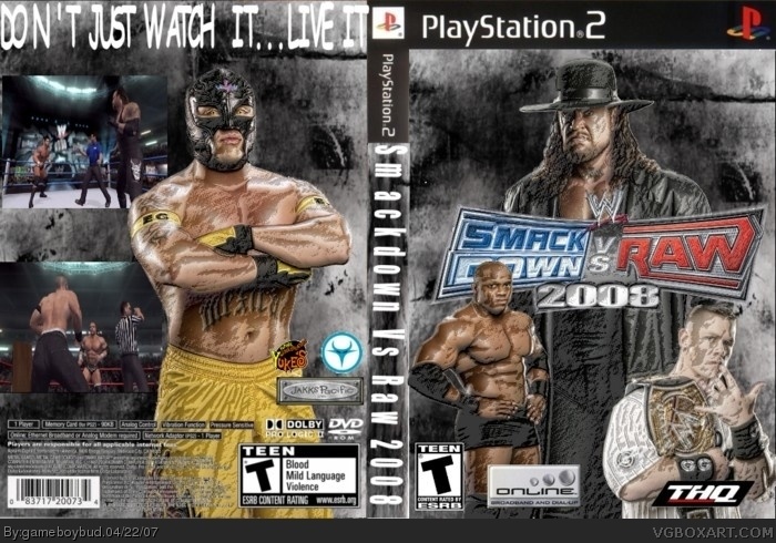
this is my second svr 2008 box.
credit to lord arcneus or crayon man i forgot whose template this is.
[ Reply ]
Its not my template, so maybe lord arcanus
[ Reply ]
ok
[ Reply ]
it's an ok box but the texture on the front make the guys looking strange 3/5
btw could you come see my Final Fantasy box plz
[ Reply ]
3.5/5
[ Reply ]
That effect you've put on every layer, yeah that doesn't work, it's horrible. The color world is poor. Character positions could be better. I don't like how Bobby's head is over the logo.
It is just a few guys standing there in front of a grey background, it just looks empty and unimaginative. 1/5
I suggest that you focus on such things as dark backgrounds, blending and modifying the color world.
[ Reply ]
I see what you were doing with this, you were going for kind of a mosaic/charcoal look to the box, very original and positioning of the characters are decent, i give you 3/5...also please check out my smackdown vs. raw 2008 boxart on the critiques forum please thanks!
[ Reply ]
this is awesome 5/5
[ Reply ]