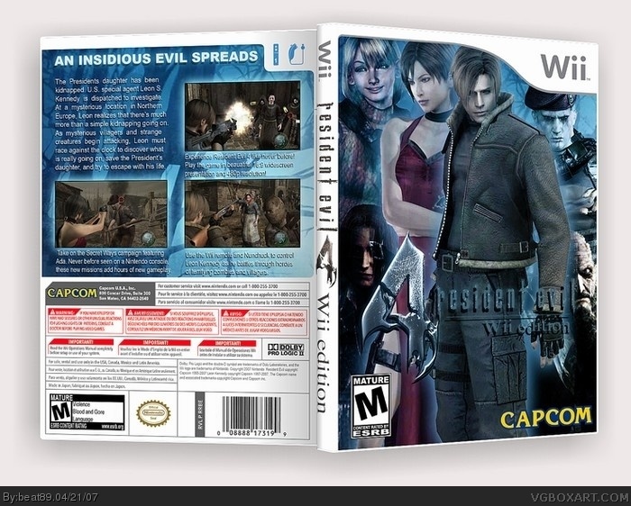
I really like this one. I think it's one of my best. That's my own Wii template, and credit to Ricardo for the Capcom logo. I rendered the RE4 logo myself.
I like the blue tint and the way you've presented the thing, except on the spine the 4 not being in the same direction of the rest of the text there is rather annoying. A very respectable effort nonetheless.
nice job, the spine doesn't really bother me, but i think the capcom logo is too big, the main logo is a tad hard to see, and the back is neatly organized but fairly plain.
 Resident Evil 4: Wii Edition Box Cover Comments
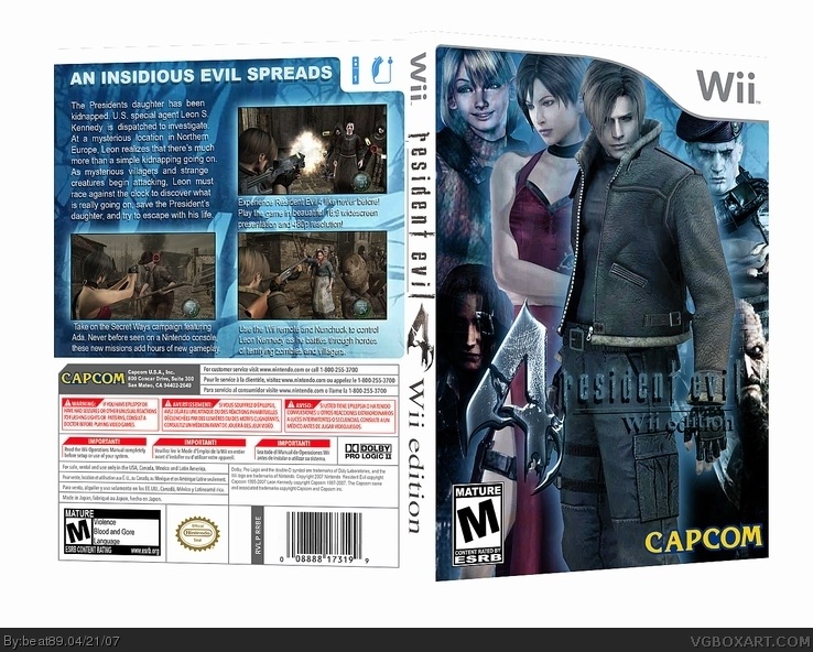
I really like this one. I think it's one of my best. That's my own Wii template, and credit to Ricardo for the Capcom logo. I rendered the RE4 logo myself.
[ Reply ]
the spine looks a bit odd...
[ Reply ]
I like the blue tint and the way you've presented the thing, except on the spine the 4 not being in the same direction of the rest of the text there is rather annoying. A very respectable effort nonetheless.
[ Reply ]
nice job, the spine doesn't really bother me, but i think the capcom logo is too big, the main logo is a tad hard to see, and the back is neatly organized but fairly plain.
[ Reply ]