New box!
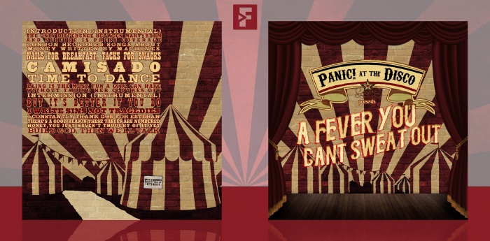
It's been a while since I made a music cover, and fortunately an idea sparked for me just recently related to a band that I've been listening to a lot for the last couple of days: Panic! at the Disco. I just thought their music was really fun to listen to, and I Write Sins Not Tragedies is a song that reminds me a lot of my childhood (a bit weird, but oh well). So, here's what I made. The theme I was trying to get with this cover was that of an old theatre of some sorts, inspired a bit by their video for Build God, Then We'll Talk, although I'm not sure if that vibe comes off that well.
Anyways, as always, constructive criticism is welcome and huge thanks to rob2197, Martiniii332 and Paper for their help and feedback on the forums, it's greatly appreciated!
Hope you guys like it! :D
 A Fever You Can't Sweat Out Cover Comments
Comment on FrankBedbroken's A Fever You Can't Sweat Out Cover.
Looks great dude - nice job
[ Reply ]
Thanks, Mat! :D
[ Reply ]
I like the colours and how you've used the displacement function to make it look like it's sprayed on the wall. I think it could be a bit stronger but never mind.
[ Reply ]
Thanks, Sarashi! I would've made it a bit stronger, but I didn't want the effect to be too harsh and I think it would've made the text a bit hard to read at points. :D
[ Reply ]
In love with the front, complacent with the back. It looks great though, don't get me wrong. Good stuff Frank.
[ Reply ]
Thanks, Martin! :D
[ Reply ]
The typeface on the back is little difficult to read due to the capitalisation and general font, but the front is fan-freaking-tactic! I love this retro, grungey theme, so this is automatically awesome to me. Great job Franco! :)
[ Reply ]
Thanks, Nathan! :D
[ Reply ]
Echoing the others about loving the front. It's fantastic, though I wonder why you left it on overlay(?). I think I would have preferred the lines behind it not being visible and it laying on top.
As for the back, I can see the direction you're aiming for, but I don't think the typeface was quite right. I'm not sure. Something does still like it's missing on the back though.
[ Reply ]
Thanks, Lucid! Yeah, I'm also a bit unsure at the moment about the back, but I didn't know what could I do to make it look better, any ideas you might have for it?
[ Reply ]
Sexy.
[ Reply ]
Thanks, Rob! :D
[ Reply ]
Great work Frank, I really like this. Could the back work if you have the curtains & stage on it too. Have the block of text as it is now but in the middle of the stage.
[ Reply ]
Thanks, Vince! I thought about it, but I'd reckon it would look a bit repetitive imo. :D
[ Reply ]
@FrankBedbroken I think it could work quite well. As long as the tents in the background were different, it wouldn't seem that repetitive. Anyway, this is nice either way
[ Reply ]
Nice work
[ Reply ]
Thanks, Edward! :D
[ Reply ]
Nice work man
[ Reply ]
Thanks, Devils! :D
[ Reply ]