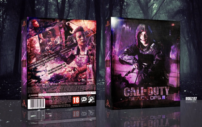
My submission into the Goodnight 2015 competition. Not a big fan of the Call of Duty franchise but I like a decent stealth experience, so I based the box on a concept of the game having a larger stealth focus, especially the front.
[ Box updated on November 28th, 2015 ] [ original ]
 Call Of Duty - Black Ops 3 Box Cover Comments
Comment on rob2197's Call Of Duty - Black Ops 3 Box Art / Cover.
The title is a bit hard to read. But the rest looks really awesome, great job and good luck for the comp'!
[ Reply ]
The logo on the front and one of the quotes on the back is a bit too hard to read. Other than that, it's great. Very different from the other BO3 boxes. Good luck in the comp.
[ Reply ]
This looks really good in terms of visuals and textures, but legibility is kind of an issue with the text. More so in the back then the front. But good job, and good luck in the competition!
[ Reply ]
I agree with the other commenters. Visually, it's top notch, really fantastic work. But the text and logo are really hard to read. Nice job overall though, Rob, and good luck! :)
[ Reply ]
Thanks guys I'll look into improving the text visbility
[ Reply ]
I would just get rid of the words on the back, I feel they just get in the way of the pictures. Great work by the way.
[ Reply ]
Yeah I'd be mirroring everyone else in my comment. It's awesome, but I think the grunge on the back is way too heavy. Also the title is hard to read
[ Reply ]
Love it man, looks amazing. Great colours. Good luck in the comp
[ Reply ]
как вы достали жополизы херовы. обложка говно, все залито одним цветом. а вы это лайкаете как кошки валерьянку.
[ Reply ]
"Remember, no Russian"
[ Reply ]
Updating at the moment, tried to make the back less grunge and text heavy, brought forward more bold imagery and made the title on the front easier to make out, just have to wait for the update to go through.
[ Reply ]
Updated full image - link
[ Reply ]