![]() »
»
Hello everyone.
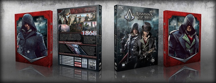
Here is my new box, and next cover for "Assassin's Creed Syndicate" ( you can check previous cover here link )
I made this box with one of my friends "AMIR-013" (link) who lost his account just for telling lie from some person.He did his activities without wrong but others because of jealousy caused who lost his account.
Hope you all guys like it.
Enjoy
 Assassin's Creed Syndicate Box Cover Comments
Comment on iman pro's Assassin's Creed Syndicate Box Art / Cover.
Haha good minds think alike. Really good man, tell Amir well done too.
[ Reply ]
It's a good design on the whole, but I would like to outline some flaws.
• In my opinion, the red on the slip case and the back doesn't work very well. Small specs of red would have been better.
• The drop shadow around the logo is too heavy. You should either lower the opacity or change it to overlay.
• The back to me seems uninspired and bland in comparison to the front (which by the way I think looks impressive). It seems generic in the sense that it is extremely similar to many other backs on VGBA in terms of structure.
Overall, it's not bad, but I think the back and slip case let it down.
[ Reply ]
^ I kinda agree with what nathan says about the slipcase, the red is a tad strong
[ Reply ]
Wow really awesome!
[ Reply ]
i love it back
[ Reply ]
good work
[ Reply ]
Good work
[ Reply ]
I quite like the slip cover and front of the box. The back has some small issues though. It's a bit to crowded for my taste (a cut down in the text will give it more breathing space) The lines in red from the screens are a bit hard to read (I'd suggest changing the color or give it a light outer glow) The header font and main text, look to modern for the Victorian era the game takes place in (a more medieval font would do the job imo.)
[ Reply ]
super cool. immediately obvious,that worked masters)Printable?
[ Reply ]
nice
[ Reply ]
Colors are a bit dark and heavy, in any case good
[ Reply ]
Will there be a printable version?
[ Reply ]
congrats iman ;)
[ Reply ]
Congrats bro . . .
[ Reply ]
Thanks for comments.guys.
[ Reply ]