I think a lot of this could be made better by just changing the colour of the Synicate on front and back and black text on the back. As it is now its all quite hard to read.
Also maybe making more space between the text on the back by adding a render or screenshots. Or even the assassins hand render just to split up the text. If you needed to you could reduce the amount of text there is too.
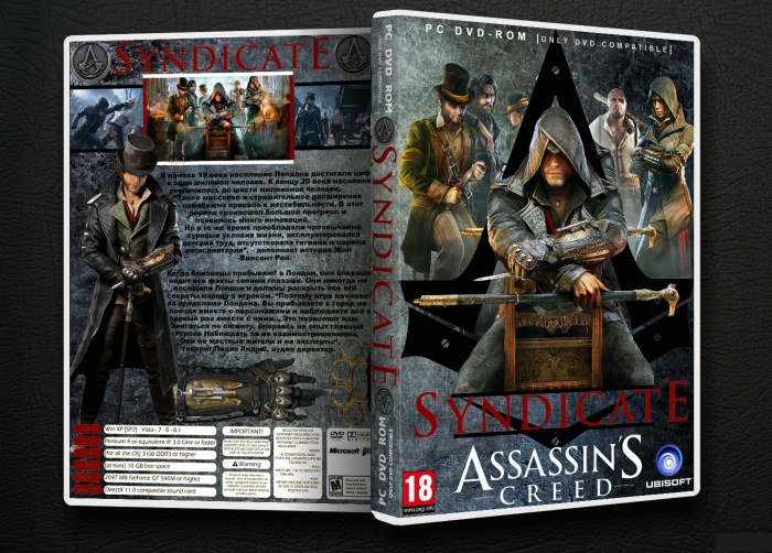
 Assassin's Creed Syndicate Box Cover Comments
Good Job. Front Is Too Nice And Better From Front Of My ACS Cover. Keep Up
[ Reply ]
Nice Work :-$
[ Reply ]
Thank you guys very nice, I'm glad you liked it
[ Reply ]
Nice work.
[ Reply ]
thanks
[ Reply ]
I think a lot of this could be made better by just changing the colour of the Synicate on front and back and black text on the back. As it is now its all quite hard to read.
Also maybe making more space between the text on the back by adding a render or screenshots. Or even the assassins hand render just to split up the text. If you needed to you could reduce the amount of text there is too.
[ Reply ]