Updated with new 3D BOX!!!!! I did this in Paint.NET, so it was really hard. I messed up a bit on the spine as well with the sizing on the box and such. If you all say so, I will update the box with the original cover.
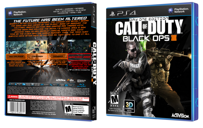
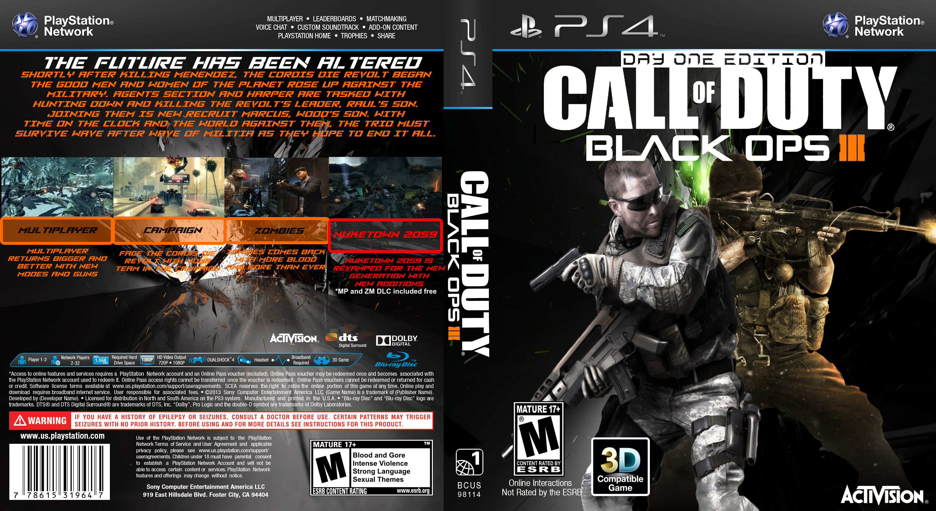
In heavy anticipation of the new CoD, here is a mock box art for the new game. Since no assets exist as of now, I used images from Ghosts, Black Ops, and Black Ops II.
Everyone's plan for the new game:
1. Buy a PS4
2. Buy the game
3. Play multiplayer
4. Rage balls off
5. Play Zombies
6. Rage balls back on
7. Complete Campaign
8. Rage balls off because of ending
9. Go back to Multiplayer
10. Buy All DLCs
11. Rage Again
12. Buy Customization Packs
13. Sell Game
14. Buy game after Ghosts 2 (*shudders*) releases
15. Buy Ghosts 2 (*shudders*)
16. Realize this game is actually good.
[ Box updated on April 21st, 2015 ] [ original ]
 Call Of Duty: Black Ops III Box Cover Comments
Comment on LoneWulfStudios's Call Of Duty: Black Ops III Box Art / Cover.
Since you're using Paint.NET, I would recommend that when you're resizing a render or an object, hold the Shift key while resizing it, so it doesn't get distorted. I tell you this because I feel like some of the elements on the box look distorted.
Also, I don't feel like having assets from different games works well, even though they share the same artstyle, the lighting makes it seem like they don't fit with each other, or with the background, for that matter. I think it would be best if you had a location of the game behind it, instead of an abstract shape.
The back isn't bad, but again, I feel like you shouldn't have an abstract shaped background behind the text. Also, I suggest you to not make the font in the summary the same as the one on the tagline, to make it feel less repetitive and easier to read. A font that works very well for summaries is Helvetica and his variants, easy to read and works well with most of stuff. Aside from that, the structure's good, although I'm not that big of a fan of that negative space beneath the screenshots. My recommendation would be to lower the screenshots a bit, shrink the text a bit and move it to the right, and add a character to make it less text heavy.
Overall, I think it could use some fixing, but it has some potential, the back especially. I would advice you to post the stuff that you're working on in the Works in Progress section of the forums, and you can check out some Paint.Net tutorials on the Help, Tips and Tutorials section of the forums also. You're on the right track here, but the execution could be better. Sorry if I come off as mean in my remarks, I'm starting to feel like a dick everytime I post a comment like this.
Also, my plan for the new game:
1) Not buy it because it's going to be the same thing as Advanced Warfare and before, cause Activision won't give a damn about making innovative and fun games anymore.
2) Profit.
[ Reply ]
Thanks for the feedback! I also made a 3D version of this box (I will update it soon) but had I seen this I would have changed the stuff. I sadly forgot to save a WiP file for this one so I cant fix any of this without redoing the whole box.
[ Reply ]
you have PS4 ?
[ Reply ]
no, I was planning on getting the Arkham Knight PS4 Bundle when it comes out.
[ Reply ]
@LoneWulfStudios don't forget add me on your friends
[ Reply ]