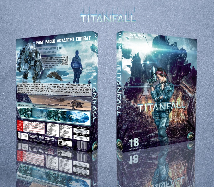
I love the blue tone and lens flare on the front, it works very well. However, I do not like the low resolution of artwork you have. I'm pretty sure you can find some higher resolution artwork somewhere. The logo on the front could use a drop shadow so it stands out a bit better.
The back could be better organized. The two taglines is kind of unnecessary. The screenshot above the lower screenshots is badly stretched and thats a issue.
 Titanfall Box Cover Comments
kya baat hai gaand fat gai banane mein teri
wase thik hai baai
[ Reply ]
fat to gai wase zayada time nahi lagaya
bass chap diya
shukriyaa
[ Reply ]
very nice
[ Reply ]
thanks man
[ Reply ]
Amazing Design, Front Is Pretty Good. Like BRO, LIKE
[ Reply ]
thanx bro
[ Reply ]
you getting better
nice
[ Reply ]
thankx
[ Reply ]
thanx
[ Reply ]
so cool
[ Reply ]
yeah
[ Reply ]
yeah
[ Reply ]
nice but for the god printable pls
[ Reply ]
I love the blue tone and lens flare on the front, it works very well. However, I do not like the low resolution of artwork you have. I'm pretty sure you can find some higher resolution artwork somewhere. The logo on the front could use a drop shadow so it stands out a bit better.
The back could be better organized. The two taglines is kind of unnecessary. The screenshot above the lower screenshots is badly stretched and thats a issue.
[ Reply ]
thanx i will try some differ
[ Reply ]