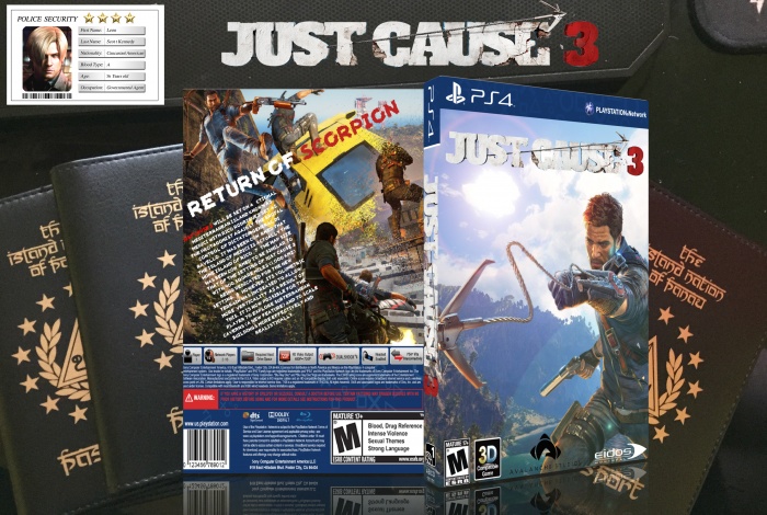
Front cover looks like it was done very lazily. Rico looks squished to fit the image on screen. The background doesn't give me enough of an open-world feel and overall the front just doesn't feel like its a Just Cause game which is all about action and blowing stuff up. A dude with a grappling hook fired at nothing and a gun flying through the air with a peaceful lookin island behind him doesnt make much sense for what the game is. The logo is poorly cut out, l I can see the blue bits from the sky background it came off of. My advice is to work on creating more of an action packed front cover that fits in well with the game Additionally, the developer logos are a little too big and everything down there is riding a little too close to the edges of the box.
The back has more of a Just Cause feel to it, action and chaos aplenty. However, there's not enough in the screenshots to tell you what exactly is going on its just close up shots of Rico and they're so close together and overlapped so much it's a little redundant since they're the main focus of the back. Zoom out and maybe make everything a little more distinguishable instead of clashing into everything else. The headline text is good (possibly a bit too big) but the summary text shouldnt be rotated so much or coming that close to the edge on the left. it's riddled with spelling errors and doesn't even explain what you do in the game, it just gives details about the game world. Straighten it out and find a real summary of the game including plot details. Maybe work on font choice and making sure it doesnt get lost in the background too. There's some potential on the back it just needs to be reworked and refined a lot more.
 Just Cause 3 Box Cover Comments
Nice work leon
[ Reply ]
Thank's bro
[ Reply ]
I love the front cover, but it doesn't really tie in well with the busy back cover. But overall amazing.
[ Reply ]
OK thank's
[ Reply ]
Keep UP
[ Reply ]
Alright thank's
[ Reply ]
Nice
[ Reply ]
Thank's my friend
[ Reply ]
Front cover looks like it was done very lazily. Rico looks squished to fit the image on screen. The background doesn't give me enough of an open-world feel and overall the front just doesn't feel like its a Just Cause game which is all about action and blowing stuff up. A dude with a grappling hook fired at nothing and a gun flying through the air with a peaceful lookin island behind him doesnt make much sense for what the game is. The logo is poorly cut out, l I can see the blue bits from the sky background it came off of. My advice is to work on creating more of an action packed front cover that fits in well with the game Additionally, the developer logos are a little too big and everything down there is riding a little too close to the edges of the box.
The back has more of a Just Cause feel to it, action and chaos aplenty. However, there's not enough in the screenshots to tell you what exactly is going on its just close up shots of Rico and they're so close together and overlapped so much it's a little redundant since they're the main focus of the back. Zoom out and maybe make everything a little more distinguishable instead of clashing into everything else. The headline text is good (possibly a bit too big) but the summary text shouldnt be rotated so much or coming that close to the edge on the left. it's riddled with spelling errors and doesn't even explain what you do in the game, it just gives details about the game world. Straighten it out and find a real summary of the game including plot details. Maybe work on font choice and making sure it doesnt get lost in the background too. There's some potential on the back it just needs to be reworked and refined a lot more.
[ Reply ]
wow wow wow calm down man.take it easy my friend.
Just tell me the bug's summary.
[ Reply ]
@Leon.S.Kennedy I am calm and taking it easy?? Your box isn't good and I'm telling you what's wrong and how to improve it.
[ Reply ]
nice
[ Reply ]
Thank's Dheeraj
[ Reply ]
nice
[ Reply ]
Thank's ajay
[ Reply ]
cool bro
[ Reply ]
Thank's
[ Reply ]