However the front and back covers dont really match each other. I would say the back doesnt fit the idea of the game... on a note pad.
Also the front the wolf looks like its giant next to the tiny house. Both look quite super imposed... Try to make the renders blend a bit better with the background. The background is distorted... Always keep pictures, renders & logos etc in proportion. The logo would look better bigger and centered too. As it is now is too small and getting cut off the edge.
Anyway i hope these tips can help you in the future. Good luck.
 Mystery Case File Dire Grove Box Cover Comments
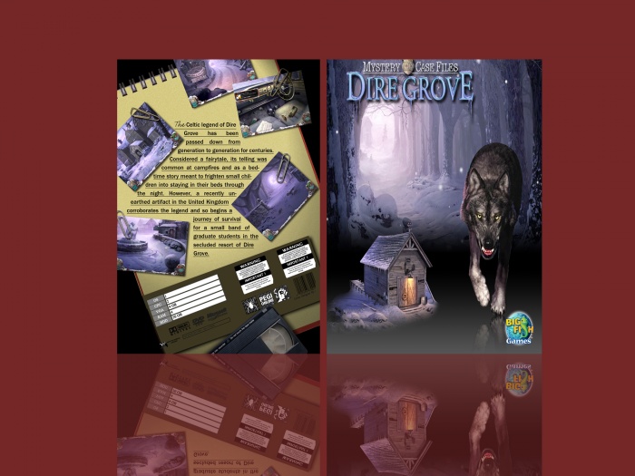
It's alright for your first case i guess.
However the front and back covers dont really match each other. I would say the back doesnt fit the idea of the game... on a note pad.
Also the front the wolf looks like its giant next to the tiny house. Both look quite super imposed... Try to make the renders blend a bit better with the background. The background is distorted... Always keep pictures, renders & logos etc in proportion. The logo would look better bigger and centered too. As it is now is too small and getting cut off the edge.
Anyway i hope these tips can help you in the future. Good luck.
[ Reply ]