![]() »
»
New box!
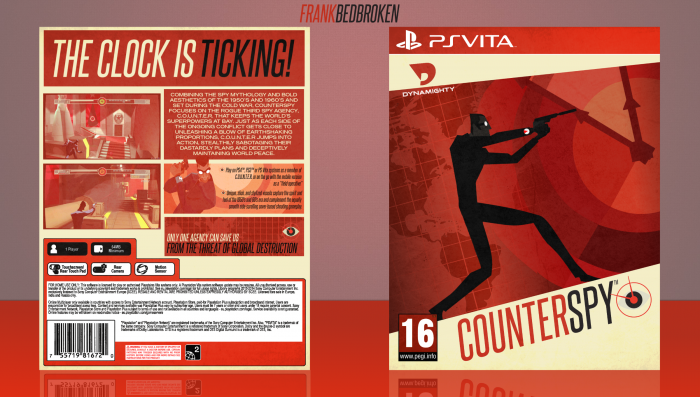
So, this is my box for the soon to be Paper's Indie Competition (or whatever is called). Started looking some games that could be classified as indie on Wikipedia, and I found about this game, Counterspy. Haven't played it, but I'm really digging the cel-shaded and retro aesthetic it has. Apparently it's not that good, though. Some issues with IA and framerate and such. Also, this is my 30th box on the site, so, thank you guys for the support and for sticking with me throughout this few months. You guys are amazing.
Anyways, as always, constructive criticism is welcome, and huge thanks to Paper and Hyperboy Prime for the help and the feedback on the forums, it's really appreciated. Also, credit to Pharaoh for the PSVita template which I slightly altered.
Hope you guys like it! :D
 CounterSpy Box Cover Comments
Comment on FrankBedbroken's CounterSpy Box Art / Cover.
Looks really good, i cant find any problems :P
[ Reply ]
Thanks, Alternation! :D
[ Reply ]
Really love the consistent colour scheme here. Looks great, good job Frank! ^-^
[ Reply ]
Thanks, Mat! :D
[ Reply ]
fantastic mr.designer ;)
[ Reply ]
Thanks, Amin! :D
[ Reply ]
Reminds me of The Incredibles lol, great job Frank! I really like it ;)
[ Reply ]
Thanks, Nathan! Some members from Dynamighty were originally from Pixar, so that might've sparked the similarity in their artstyles. :D
[ Reply ]
Oh wow, this is amazing. Love the colours and layout. Amazing work Frank
[ Reply ]
Thanks, Vince! :D
[ Reply ]
Yeah I really like this! awesome colour scheme, very simple but really effective, really good job.
[ Reply ]
Thanks, PS! :D
[ Reply ]
The composition of this is pretty damn stellar. I really love how dynamic everything is and the front is fantastic in terms of color. Unfortunately, I feel like the back is lacking the same contrast as the front and seems very washed out. I understand the intention of keeping the palette quite neutral, but there should have been a bit more black thrown into the mix up.
Great job on though overall box though. :)
[ Reply ]
Yeah, in the end the front looks darker than the back in terms of color, now that you mention it. Where do you think black or darker shades would fit well? Thanks for the feedback, Lucid! :D
[ Reply ]
@FrankBedbroken Hmm, it's hard to say. Definitely somewhere around the middle, but borders around the screenshots would look too out of place. How about in the screenshots? I would try tweaking them differently instead of keeping it monotone, considering the screenshots had splashes of red in them beforehand too. Also looking at this again, I think the summary being flush left would have looked better and much more dynamic to fit the overall box's feel, since the text under it are flush right and left.
[ Reply ]
@lucidhalos Tried darkening the colors of the back, adding some black to the screenshots, and aligned the summary text to the right. I'm not really sure on how the screenshots look. What do you think? link
[ Reply ]
@FrankBedbroken I like the text better, but the screenshots I feel like should be tweaked some more in terms of lighting, because now they're a little too dark.
[ Reply ]
LOVE this! For some reason it reminds me of the end credits of the incredibles haha, but I really love the artstyle!! Never heard of the game though, I'll have to check it out :)
[ Reply ]
Thanks, Tim! Actually some of the guys that work at Dynamighty used to work at Pixar, so that might've inspired the similarity between the two. :D
[ Reply ]
Amazing work,love the simplistic design and the whole color scheme with the red and everything. good job!
[ Reply ]
Thanks, HyperBoy! :D
[ Reply ]
This is great Frank, the whole idea and cover itself, but there's 1 thing, that light u put in back isn't good if u ask me, I think it could be better if it was dark like front, Otherwise it's a great box, good job :)
[ Reply ]
Yeah, I think I should've settled with a darker color scheme on the back, I'll fix it on the next update. Thanks for the feedback, Matin! :D
[ Reply ]
Fantastic Job Man..Well Deserved HOF Very Soon.
[ Reply ]
Thanks, Ben! :D
[ Reply ]
Definetly got the look of the game down!
[ Reply ]
Thanks, kacboy! :D
[ Reply ]
Congrats Frank! well deserved =D
[ Reply ]
Thanks, PS! :D
[ Reply ]
Finally, Congrats Frank, Very well deserved . . .
[ Reply ]
Thanks, Matin! :D
[ Reply ]
Congrats Frank ;)
[ Reply ]
Thanks, Amin! :D
[ Reply ]
Congratulations man
[ Reply ]
Thanks, Vince! :D
[ Reply ]
Damn Man, HoF already, congrats mate
[ Reply ]
Thanks, Hyperboy! :D
[ Reply ]
Wow, that was really quick! Thanks, everybody! :D
[ Reply ]
Congrats Frank, fantastic job ;)
[ Reply ]
Thanks, Nathan! :D
[ Reply ]
Congratulations Frank! ^-^
[ Reply ]
Thanks; Mat! :D
[ Reply ]
Very nice. I like the shades of red on the box
[ Reply ]
Thanks, Sonix! :D
[ Reply ]
Congrats Frank!
[ Reply ]
Thanks, Alternation! :D
[ Reply ]
Diggin' this, though I'm personally not a fan of changing the colors of official stuff like the template and the PEGI rating to match the color scheme of the design. One thing I'd definitely get rid of is the red hue on the screenshots.
[ Reply ]
Thanks, Sven! Yeah, I actually made an update where I took the red out of the screenshots, and I replaced it with a black hue, to add a bit more of black to the back in comparison to the front. Maybe I should remove the hue altogether. Also, I get what you mean with the change of color in the template and the PEGI rating, but I felt like if I left the original colors it would clash with the design I have going on. Might've worked well, though. Anyways, thanks for the feedback. :)
[ Reply ]
No problem dude. Nice work overall, lookin' quite stylish.
[ Reply ]
this honestly rules, I love the art style and the color scheme. very nicely done
[ Reply ]
Thanks, Hunter! :D
[ Reply ]
Lovely use of the flat cell shading. Love the implementation of the assets too.
[ Reply ]
Thanks, dude! :D
[ Reply ]
Wow man this is chutterkhan box
Really really you are my best designer
[ Reply ]
..."chutterkhan"?
Thanks for the compliment, though. But seriously, what does that mean?
[ Reply ]