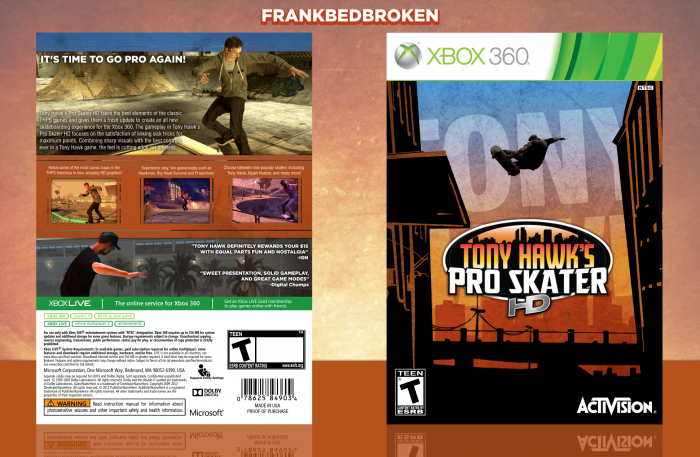
New box!
So, Tony Hawk's Pro Skater HD, I found this to be a pretty good game, even though most people didn't really like it. Although, I can understand sometimes, seeing as the controls are kinda shit, but anyways, I still like it. I've been wanting to make a THPSHD since I joined the site, but couldn't get an interesting design out of it, but I finally did. I think.
Anyways, constructive criticism is welcome and huge thanks to Hades, TheTombRaider, Paper and spypilot for the help and the feedback on the forums, it's really appreciated.
Hope you like it! :D
 Tony Hawk's Pro Skater HD Box Cover Comments
Comment on FrankBedbroken's Tony Hawk's Pro Skater HD Box Art / Cover.

I much prefer the front. I don't know if I like the bar at the top on the back. Apart from that it's too notch. Great work
[ Reply ]
Thanks, Vince! I was inspired by the back of Project 8, which had some overlapping on it, so I tried to use that on the back of this one. If many people find that bothersome, I can remove it on the next update. Again, thanks for the feedback! :D
[ Reply ]
i would post a comment, but it would be the same as Vince said, good case ;)
[ Reply ]
@AlternationHD Thanks, Alternation! :D
[ Reply ]
@FrankBedbroken I should say that I feel it's the colour more than the actual bar itself.
[ Reply ]
@Vince_1990 I wanted to make some sort of relation with the front and the back, as the front has that splash of blue there on the top.
[ Reply ]
@FrankBedbroken one thing that wasn't mentioned is that I really like that you kept the retro style of cases at the back where every case had pictures popping out. Hopefully you know what I mean
[ Reply ]
@AlternationHD Yeah, I get what you mean. Thanks! :D
[ Reply ]
As I said in the WIP, after that final update, this cover looks amazing! I do really like, great job Frank!
[ Reply ]
Thanks, Nathan! :D
[ Reply ]
This came together really well, super solid design, good job man.
[ Reply ]
Thanks. PS! :D
[ Reply ]
Like it frank...
[ Reply ]
Thanks, JR! :D
[ Reply ]
that front.. woah.
[ Reply ]
Thanks, Tim! :D
[ Reply ]
I agree with vincent for the back, But the whole box is nice and front really amazing for me frank . . .
[ Reply ]
Thanks, Matin! :D
[ Reply ]
Very Nice Mr.Designer ;)
[ Reply ]
Thanks, Amin! :D
[ Reply ]
I think you hit a home run here, Frank. The colors are great. Everything seems fundamentally correct. It flows. Everything checks out.
It has a very horizontal feel. I'll take it that during the street vs. vert episode of Rocket Power that you were on Reggie's side? (Please someone get the reference)
[ Reply ]
Thanks, GRP! Also, I've watched Rocket Power before, but it has been a while since I watched it, and the only thing I know is that "we've been INVADED by SHOOBIES!" (btw, they never explained what the heck's a shoobie). :D
[ Reply ]