This is pretty generic and boring, although I don't mind the front. Also, the presentation draws more attention to the images rather than the box; you should change that. Overall it's not too bad, but the back requires improvements.
@DamonTheVampire yeah, sorry, there isn't too much text. TBH; the amount of text is okay, but it could be a BIT smaller and you should reduce the spacing between the lines to make more room for artwork. Also, work on contrast and saturation. Keep it up :)!
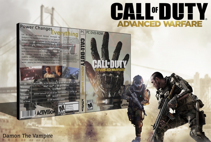
 Call of Duty Advanced Warfare Box Cover Comments
This is pretty generic and boring, although I don't mind the front. Also, the presentation draws more attention to the images rather than the box; you should change that. Overall it's not too bad, but the back requires improvements.
[ Reply ]
Your DMC box was much better
[ Reply ]
@TheTombRaider you're right. tnx
[ Reply ]
Too much text on the back, and it's handled in a very uninspired way.
[ Reply ]
@aldimon there isn't TOO MUCH text but i agree that it's handled unispiredly. tnx
[ Reply ]
@DamonTheVampire yeah, sorry, there isn't too much text. TBH; the amount of text is okay, but it could be a BIT smaller and you should reduce the spacing between the lines to make more room for artwork. Also, work on contrast and saturation. Keep it up :)!
[ Reply ]
@aldimon again tnx
[ Reply ]