This could improve. First of all, the front is just the image that Starbomb uses at the beginning of their music videos stretched to fit the size of the template.
The back is a bit plain, having a stretched out logo and text on a solid black background.
It's not very good, but it could massively improve if you posted your work on the Works in Progress forum, see the feedback that you get, try to fix it, and then post it on the main site.
Read this. I agree with most everything listed here.
I like that it is simple, it reminds me of this Metro Station album link. That being said, the text used for the track listing should be a bit more interesting. I suggest looking at this album cover for further inspiration.
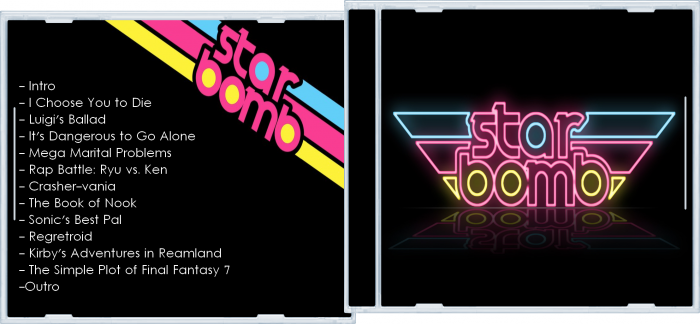
 Starbomb Cover Comments
My first cover of music.
[ Reply ]
This could improve. First of all, the front is just the image that Starbomb uses at the beginning of their music videos stretched to fit the size of the template.
The back is a bit plain, having a stretched out logo and text on a solid black background.
It's not very good, but it could massively improve if you posted your work on the Works in Progress forum, see the feedback that you get, try to fix it, and then post it on the main site.
[ Reply ]
Read this. I agree with most everything listed here.
I like that it is simple, it reminds me of this Metro Station album link. That being said, the text used for the track listing should be a bit more interesting. I suggest looking at this album cover for further inspiration.
[ Reply ]
Yes, but I wanted a simple cover.
[ Reply ]