Hey man, I thought I misread it when "Martin posted a new Box" popped up.
Good to see I didn't misread.
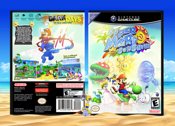
The box is very nice! I gotta say, the presentation is outstanding, while the box itself has a very light feel. The reflection on the front looks great and works perfectly with all the light you used.
There is also much light on the back, which is great. The back really works with the front, overall, great stuff. Dig it.
There are a few things that are bothering me though; somehow, the "Only for" thingy is bigger than the plastic of the template, which looks really weird. Second, the "dark days" kinda bothers me, because it doesn't fit the tone of the rest of the box.
Those are very small, minor errors though. Good job!
The front is longer than the plastic to illustrate the cover wrapping around the plastic, which, in this 2D representation, makes it look like it's longer.
This is great. The light and sunny feeling from this box is so fitting to this title. The only thing I see, which is very minor, is maybe it may look a little better if the text box was longer to cover some of the negative space beneath it. This is a very little comment and it may look better as it is now, I would have to see.
Cheers to you mate, way to deliver!
Very good, only thing that bothers me is that Mario and Peach's renders are low quality, but this isn't exactly your fault... So besides that, I love it ;)
 Super Mario Sunshine Box Cover Comments
Cool. As. Fuck.
Nice job, Martin. ;)
[ Reply ]
dude is that really your first acc?
you totes sound like the second acc of someone
[ Reply ]
@aldimon I swear, this is my first account.
[ Reply ]
@FrankBedbroken kewl.
[ Reply ]
Hey man, I thought I misread it when "Martin posted a new Box" popped up.
Good to see I didn't misread.
The box is very nice! I gotta say, the presentation is outstanding, while the box itself has a very light feel. The reflection on the front looks great and works perfectly with all the light you used.
There is also much light on the back, which is great. The back really works with the front, overall, great stuff. Dig it.
There are a few things that are bothering me though; somehow, the "Only for" thingy is bigger than the plastic of the template, which looks really weird. Second, the "dark days" kinda bothers me, because it doesn't fit the tone of the rest of the box.
Those are very small, minor errors though. Good job!
[ Reply ]
And again, stellar presentation. Would bang.
[ Reply ]
@aldimon thanks dog.
The front is longer than the plastic to illustrate the cover wrapping around the plastic, which, in this 2D representation, makes it look like it's longer.
[ Reply ]
@Martiniii332 ohhh okay. I get it. Still, looks a bit weird.
[ Reply ]
its shit
[ Reply ]
0/10 awful rite
[ Reply ]
yeah, well... you both like fingers in your ass
[ Reply ]
@Martiniii332 nothing wrong with that
[ Reply ]
11/10 its okay ya boy martin
[ Reply ]
This is great. The light and sunny feeling from this box is so fitting to this title. The only thing I see, which is very minor, is maybe it may look a little better if the text box was longer to cover some of the negative space beneath it. This is a very little comment and it may look better as it is now, I would have to see.
Cheers to you mate, way to deliver!
[ Reply ]
Very cool, I love it.
[ Reply ]
Very good, only thing that bothers me is that Mario and Peach's renders are low quality, but this isn't exactly your fault... So besides that, I love it ;)
[ Reply ]
Except they aren't low quality.
[ Reply ]
Sweet, sweet memories.
[ Reply ]
nostalgia hit me like a truck while making this.
[ Reply ]
I wish I was that good :'(
[ Reply ]