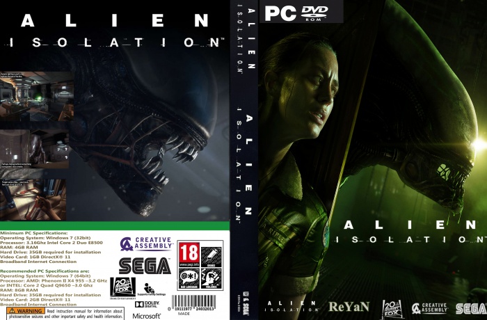
To many "Alien Isolation" logos. only needs one on front. Maybe one on spine, not two. Normally the heading on the back would be different. Wouldnt be the logo normally. The Sega logo on the spine looks squashed. Finally the back cover looks a bit plain. Needs more description about the game or bigger screen shots etc.
 Alien: Isolation Box Cover Comments
To many "Alien Isolation" logos. only needs one on front. Maybe one on spine, not two. Normally the heading on the back would be different. Wouldnt be the logo normally. The Sega logo on the spine looks squashed. Finally the back cover looks a bit plain. Needs more description about the game or bigger screen shots etc.
[ Reply ]
Not Bad...
[ Reply ]