I like the overall concept and layout of the box, but there a few tweaks I'd like to see done to fix it up: It's a little odd having 2 characters blue like that. I know the idea was to have the colors of the French flag incorporated, but the blue is half the box. I think a simple gray/white tone for all of them would have worked out better, since the background is blue-ish itself and then you have the splash of red from the logo. Or, you could have applied those three colors going down vertically instead though not sure how that would look.
On the back, I like the way information is broken down, but I'd tweak the kerning of the paragraphs so you don't have those ophans in the paragraphs.
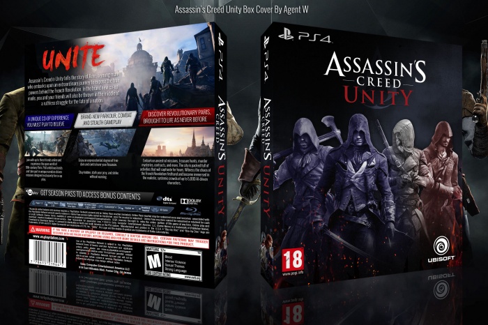
 Assassin's Creed Unity Box Cover Comments
I like the overall concept and layout of the box, but there a few tweaks I'd like to see done to fix it up: It's a little odd having 2 characters blue like that. I know the idea was to have the colors of the French flag incorporated, but the blue is half the box. I think a simple gray/white tone for all of them would have worked out better, since the background is blue-ish itself and then you have the splash of red from the logo. Or, you could have applied those three colors going down vertically instead though not sure how that would look.
On the back, I like the way information is broken down, but I'd tweak the kerning of the paragraphs so you don't have those ophans in the paragraphs.
[ Reply ]
Nice my friends ;)
[ Reply ]
Pretty.
[ Reply ]
Love the back.
[ Reply ]
very nice.
[ Reply ]
printable please
[ Reply ]
Sweeet
[ Reply ]
cool cover.
[ Reply ]
PRINTABLE PLEASE!
[ Reply ]
This is AMAZING, specially front. I love it.
Nice job. <3
[ Reply ]
ur inbox full
[ Reply ]