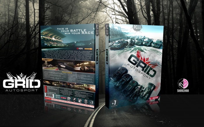
I think the overall design is nice. Great layout and nice imagery. As for the cover, the two image angles don't work together. Branching off of this design, i believe removing the bottom car line up and simply placing the Grid logo in the same angle as you have it onto the street of the top image in such a way to make it feel like it was spray painted on the ground (perspective warp/distortion possibly) would have worked best. Just a suggestion. Earned my favorite nonetheless.
 Grid Autosport Box Cover Comments
goood design . thank you
[ Reply ]
Thanks ;)
[ Reply ]
Oh God!
[ Reply ]
Thanks Mohammad ;)
[ Reply ]
Great amin.
[ Reply ]
Thanks Saeid ;)
[ Reply ]
Looks so good.
[ Reply ]
thanks
[ Reply ]
great job :)
[ Reply ]
thanks
[ Reply ]
really great .....like always
[ Reply ]
thanks artur ;)
[ Reply ]
AMAZING!!!!!!!!!!!
[ Reply ]
pretty awesome. the front reminds me of deathrace
[ Reply ]
great job :)
[ Reply ]
I think the overall design is nice. Great layout and nice imagery. As for the cover, the two image angles don't work together. Branching off of this design, i believe removing the bottom car line up and simply placing the Grid logo in the same angle as you have it onto the street of the top image in such a way to make it feel like it was spray painted on the ground (perspective warp/distortion possibly) would have worked best. Just a suggestion. Earned my favorite nonetheless.
[ Reply ]
nice
[ Reply ]
Oh. my. god. This is god damn amazing!
[ Reply ]
Please, make a printable version, pleeaase :)
[ Reply ]