Not terrible, but could be a bit better. The 3DS logo is visible on one of those screenshots, the Behemoth logo is out of place, the front cover looks a tad bit stretched, and I don't think that's Next Level's logo, though I could be wrong.
The front cover does look a bit stretched. The back is what you need to spend more time on. On your back cannot read the writing describing the game. This writing also doesn't align with anything. On the left, the writing is almost off the design. Also the 4 picture have no alignment. They just seem to be plonked on the back
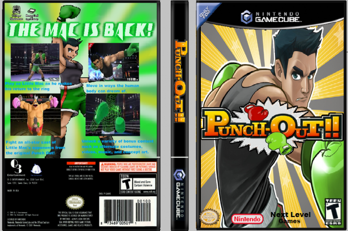
 Punch Out!! Box Cover Comments
Not terrible, but could be a bit better. The 3DS logo is visible on one of those screenshots, the Behemoth logo is out of place, the front cover looks a tad bit stretched, and I don't think that's Next Level's logo, though I could be wrong.
Definitely better than what I'm capable of.
[ Reply ]
The front cover does look a bit stretched. The back is what you need to spend more time on. On your back cannot read the writing describing the game. This writing also doesn't align with anything. On the left, the writing is almost off the design. Also the 4 picture have no alignment. They just seem to be plonked on the back
[ Reply ]
okay. Got that
[ Reply ]