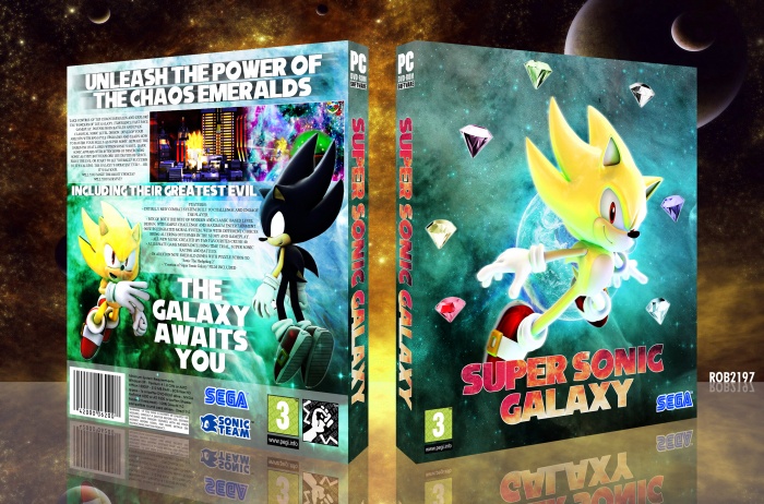
I first started this as a small parody of Super Mario Galaxy, which essentially it is, but it holds no comedic parody elements. So it's a bit of fun at it's core. I was initially working with renders of the regular blue sonic for the front but when moving forward I found the yellow/ gold of Super Sonic worked rather well with the blue backing. Honestly I quite struggled to find a decent structure to the back so please excuse how that may not be to the best quality in terms of design, but I tried my best at creating something that looked visually pleasing to me.
Seems to be getting a bit quiet around here.
Comments and thoughts are always appreciated. Thank you.
 Super Sonic Galaxy Box Cover Comments
Comment on rob2197's Super Sonic Galaxy Box Art / Cover.
Like the design and overall concept of the box. Nice bright colors to go along with the "parody" of Mario Galaxy. My only complaint is the text on the back. It doesn't go with everything going on and a lot of the text is broken up awkwardly in some places and very close to the edges of images and the box in general. I understand there is a lot of text, but when every letter is also capitilized it takes up more room.
[ Reply ]
Thanks very much, yeah I can struggle when it comes to text on the back on my boxes, something I need to work on. I'll mess around with the text a little more, see if I can get it more structured. Again thanks for the comment.
[ Reply ]
@rob2197 I would say a great study when it comes to text and finding a right one is to try the same sentence "a quick brown fox jumps over the lazy dog" is a great way to see how each letter looks based on font. Also, just filler text like Lorem Ipsum. When it comes to practice, try creating work purely out of text. Treat it like you would imagery, after all it's not just meant to be text at the end product but part of the whole piece.
[ Reply ]
@rob2197 As for all text, I do feel it doesn't have enough breathing room (its too close to the edges) as well is aligning it on the centre awkward if the text is placed like this.
[ Reply ]
@Rarity Okay guys I'll see what I can do
[ Reply ]
I think you found a good balance between paying just enough homage to Super Mario Galaxy and designing what could be a cool take on Sonic. It's really a fun design and I like it a lot.
Only notes I could offer are pretty similar to what lucihalos has already said. If you find a new font and maybe edit down the length of your synopsis and features list, that could help bring it all together a bit better.
[ Reply ]
Yeah thanks
[ Reply ]
Very Nice Brother ;)
[ Reply ]
Thanks very much
[ Reply ]