[ Buy Gears of War 2 at Amazon ] By dorrito2001 1 on March 5th, 2007 No Printable Available [ Box updated on March 5th, 2007 ] [ original ] Gears of War 2 Box Cover Comments Comment on dorrito2001's Gears of War 2 Box Art / Cover. Cancel Reply dorrito2001 1 [ 1 decade ago ] This box took a really long time for some reason but i like the way it turned out [ Reply ] Dustgunner 33 [ 1 decade ago ] It's pretty good, I don't see how it would really make box art though, I mean it's not really the kind of picture that should be used for box art [ Reply ] dorrito2001 1 [ 1 decade ago ] #2 yeah i couldnt find a pic i liked that hasnt been used 1001 times so i went with that...let me know if you have any ideas [ Reply ] Fuzzy_duck 1 [ 1 decade ago ] I like the update. One thing I noticed about games (probably just me, I'm weird that way) is that different sequels are associated with different colors. For instance, a lot of the Halo CE ads were associated with the color green. Halo 2 had a lot of orange, and Halo 3 is using blue. What I like about this, is that it changes the "color focus" from orange and red to a darkish blue. (I'm probably just strange however) 4/5 [ Reply ] Crayon Man 2 [ 1 decade ago ] #4, i agree 110% with you. [ Reply ] BlazeBlaster 4 [ 1 decade ago ] Nice, but not great. 4/5 [ Reply ] finalfantaseer22 43 [ 1 decade ago ] i liek this i dont know why it has such a low score. [ Reply ] lord_arcanus 20 [ 1 decade ago ] #7 yeah, this looks really cool. if they ever do make the sequel at least make it so you don't die so easily, 3 shots and you're dead. i agree with #4. this is really good. 4/5 [ Reply ] Zerotail 1 [ 1 decade ago ] where did you get your gears of war text? I can't find one ANYWHERE [ Reply ] robert1139 1 [ 1 decade ago ] @zerotail: He probably got it off dafont.com. That place has EVERYTHING. [ Reply ]

 Gears of War 2 Box Cover Comments
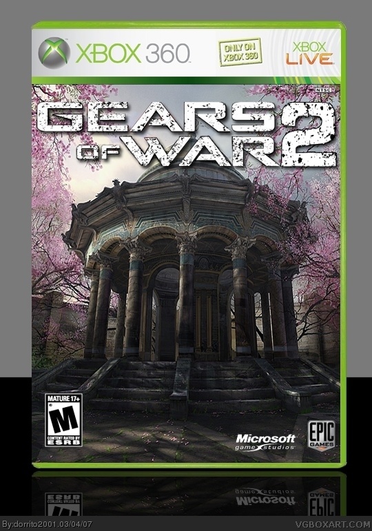
This box took a really long time for some reason but i like the way it turned out
[ Reply ]
It's pretty good, I don't see how it would really make box art though, I mean it's not really the kind of picture that should be used for box art
[ Reply ]
#2 yeah i couldnt find a pic i liked that hasnt been used 1001 times so i went with that...let me know if you have any ideas
[ Reply ]
I like the update.
One thing I noticed about games (probably just me, I'm weird that way) is that different sequels are associated with different colors.
For instance, a lot of the Halo CE ads were associated with the color green. Halo 2 had a lot of orange, and Halo 3 is using blue.
What I like about this, is that it changes the "color focus" from orange and red to a darkish blue.
(I'm probably just strange however)
4/5
[ Reply ]
#4, i agree 110% with you.
[ Reply ]
Nice, but not great. 4/5
[ Reply ]
i liek this i dont know why it has such a low score.
[ Reply ]
#7 yeah, this looks really cool. if they ever do make the sequel at least make it so you don't die so easily, 3 shots and you're dead.
i agree with #4.
this is really good. 4/5
[ Reply ]
where did you get your gears of war text? I can't find one ANYWHERE
[ Reply ]
@zerotail:
He probably got it off dafont.com. That place has EVERYTHING.
[ Reply ]