#10, sorry. Darth Spazz said you might leave. I'm sorry if I ever made you dislike me. Please don't leave. The site needs your talent. You are a very talented boxartist who we can't afford to lose. Please don't go!
but serious. you need to get your voting right. you either vote something too high and throw out a 5, or give something too low.
2/5 is "poor" and this box is not poor. its not too exciting, however it is well made so it deserves atleast a 3.
5/5 is "awesome" and they shouldnt be so common or thrown around.
#13, so you aren't leaving? YES!!!!!! I promise I'll get my voting right. I never thought about it the way you just explained it. I promise I won't give so many 5s.
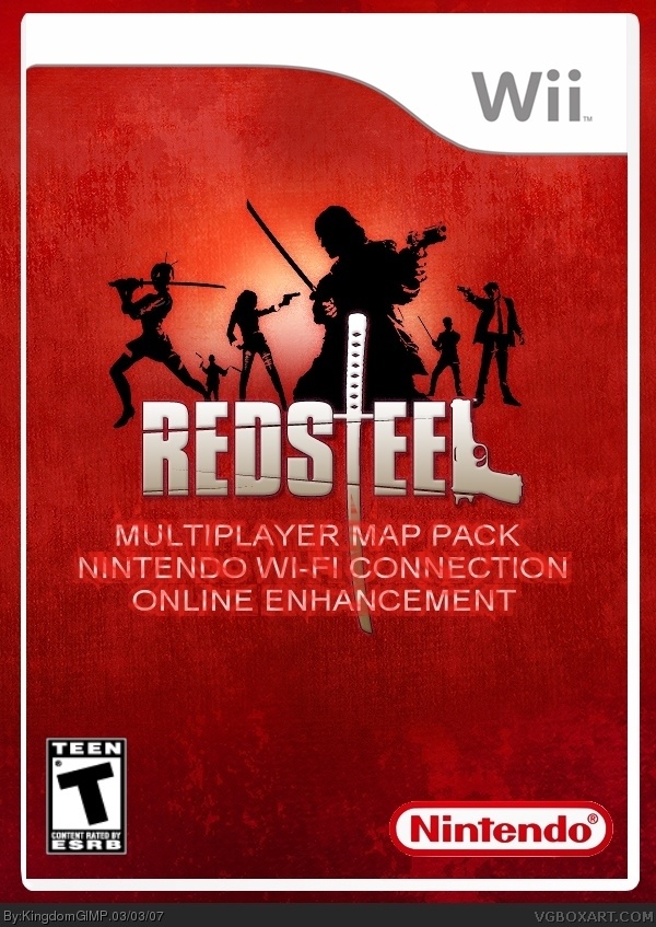
I really like this. The style is nice and crisp. But the title really is a stretched-out band., cut it down to a few words.
Maybe just:
Red Steel: Expanded

 Red Steel Box Cover Comments
This was meant to be simple. Anyone who has played Red Steel Multiplayer should knw the potentional of Online.
[ Reply ]
Excuse me, *know*.
[ Reply ]
Good lord, that's a big ass title! That's the biggest title this side of Borat. That said, the box is too bland. 2/5, man.
[ Reply ]
#3, aww, is it really that bad?
[ Reply ]
Don't rate it, tell me what needs to be fixed. I can add a back.
[ Reply ]
on the contrary, i like it alot.
and since it is only an expansion pack, simplicity is the best way to go.
4/5
[ Reply ]
Well, as I said, the title's too damn big. The Nintendo logo's a tad large. I think you need a back for sure. I won't vote until then.
[ Reply ]
#6, you just hate me.
[ Reply ]
but the nintendo logo is too big.
and it shoudl have a wifi logo.
[ Reply ]
#8, you post too much.
[ Reply ]
#10, sorry. Darth Spazz said you might leave. I'm sorry if I ever made you dislike me. Please don't leave. The site needs your talent. You are a very talented boxartist who we can't afford to lose. Please don't go!
[ Reply ]
it sucks just like all your other boxes
[ Reply ]
eh i was just spamming.
but serious. you need to get your voting right. you either vote something too high and throw out a 5, or give something too low.
2/5 is "poor" and this box is not poor. its not too exciting, however it is well made so it deserves atleast a 3.
5/5 is "awesome" and they shouldnt be so common or thrown around.
[ Reply ]
#12, excuse me? Were you talking to me? If so, God Bless Your soul, and let him sned you a prayer.
[ Reply ]
*send*.
[ Reply ]
#13, so you aren't leaving? YES!!!!!! I promise I'll get my voting right. I never thought about it the way you just explained it. I promise I won't give so many 5s.
[ Reply ]
Update.
[ Reply ]
#12, how stupid are you? KingdomGIMP is very good at boxart making! Do dig a hole and jump in.
[ Reply ]
3/5. #18, *go
[ Reply ]
good update but the wifi logo is a little choppy and it should be closer to the corner.
[ Reply ]
but not too close.
[ Reply ]
i like it but to me it kinda looks like you jut put a template over a wallpaper, correct me if i'm wrong.
[ Reply ]
#22, yes, but can you find much Red Steel Artwork? Plus, at least I made something out of it.
[ Reply ]
I really like this. The style is nice and crisp. But the title really is a stretched-out band., cut it down to a few words.
Maybe just:
Red Steel: Expanded
[ Reply ]