I don't think the full view changes the view much. This box is MUCH too bright. My eyes, my eyes! They hurt so bad! You need a LocoRoco background of some sort.
I have LocoRoco for PSP. It's a brilliant game. This is not a brilliant box. It is NOT a good bright. This is bad bright. Even white would probably be better.
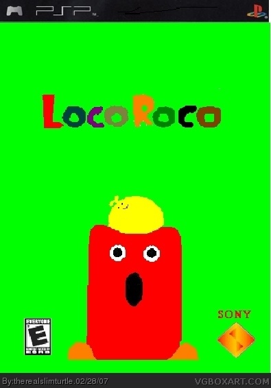
The logo looks a little choppy, and the Sony logo doesn't say "Computer Entertainment" underneath it.
Now everything looks choppy! Now we can't read "Sony Computer Entertainment" whatsoever, the logo and the image look jagged and blurry-edged. This is turning to the worse.
there isnt enough things on it and its plane. i dont want to be mean its good for paint but idk needs more. should have waited and put more on it. if you want to see stuff i made from paint i can send you a link. its good stuff.
The best way to learn is to practice. There's no need to insult other people, that's kinda childish I'd say.
Now therealslimturtle, if I was you, I'd get Gimp, Photoshop or whatever program, but leave MS Paint to the babys. You just can't expect to do a nice job with paint.
Get Photoshop (I'm not gonna tell how) and a few tutorials that you can find around Google, and practice.
TRANSLATION from troll to english:
how does this caapture the game's look? Check out the previous LocoRoco box. Does the character on this look anything like the character on that? If you guessed yes, then YOU'RE WRONG!!!
In short, dont use paint, use actual pictures from the game (unless you're a true artist and paint things with a tablet), and POST YOUR WORK IN THE FORUMS BEFORE POSTING IT ON THE SITE!

 LocoRoco Box Cover Comments
I made this almost entirely from scratch in Paint. I am well aware that PSP boxes are skinny, but it said that my skinny one wasn't wide enough.
[ Reply ]
I drew everything but the ESRB, Sony diamond, and PSP template.
[ Reply ]
Comments and ratings are more than welcome.
[ Reply ]
An update. Looks better.
[ Reply ]
Full view is best.
[ Reply ]
I don't think the full view changes the view much. This box is MUCH too bright. My eyes, my eyes! They hurt so bad! You need a LocoRoco background of some sort.
[ Reply ]
sorry. I wanted to capture the game's look.
[ Reply ]
simple and bright
[ Reply ]
with a little quirk
[ Reply ]
I have LocoRoco for PSP. It's a brilliant game. This is not a brilliant box. It is NOT a good bright. This is bad bright. Even white would probably be better.
The logo looks a little choppy, and the Sony logo doesn't say "Computer Entertainment" underneath it.
[ Reply ]
so what do you give it?
[ Reply ]
I'm not rating it until you improve it.
[ Reply ]
nah this isn't too good. the greenness isn't very appealing.
[ Reply ]
here's update 3
[ Reply ]
What the fuck? Why's it so blurry?
[ Reply ]
Now everything looks choppy! Now we can't read "Sony Computer Entertainment" whatsoever, the logo and the image look jagged and blurry-edged. This is turning to the worse.
[ Reply ]
here's 4th
[ Reply ]
I think this might be better.
[ Reply ]
Oops, white dot. Here's 5.
[ Reply ]
I really want to get a good score. I'm working my ass off in Paint.
[ Reply ]
I'd be thrilled to get a 3.
[ Reply ]
I really don't wanna spam up our site.
[ Reply ]
Background background background!
[ Reply ]
I'm sorry, but I gave it a 1, which is what it deserves. Maybe next time mate.
[ Reply ]
#23, what kind of fucking background do I need?
[ Reply ]
there isnt enough things on it and its plane. i dont want to be mean its good for paint but idk needs more. should have waited and put more on it. if you want to see stuff i made from paint i can send you a link. its good stuff.
[ Reply ]
Wow, #'s 24 and 26. You are the first people to comment on here that aren't total assholes.
TrevOwnz, I'd love to se it. PM it to me.
[ Reply ]
No one's an asshole, you just suck
[ Reply ]
GET FRIGGIN GIMP!!!!!!!!!!!!!!!!!
Its bad ok. No bg. Its real bad.
[ Reply ]
#28, says the guy whose boxes are an insult to Halo 3 and The Godfather
#29, I'd love to, but I am not allowed (roomie thinks its a virus)
[ Reply ]
#30, ok so I'm not so good, but atleast they are better than this. It doesnt even have a background
[ Reply ]
The best way to learn is to practice. There's no need to insult other people, that's kinda childish I'd say.
Now therealslimturtle, if I was you, I'd get Gimp, Photoshop or whatever program, but leave MS Paint to the babys. You just can't expect to do a nice job with paint.
Get Photoshop (I'm not gonna tell how) and a few tutorials that you can find around Google, and practice.
It's the only way to victory.
[ Reply ]
Roar snarl rawrgruntingnoises roar.
TRANSLATION from troll to english:
how does this caapture the game's look? Check out the previous LocoRoco box. Does the character on this look anything like the character on that? If you guessed yes, then YOU'RE WRONG!!!
In short, dont use paint, use actual pictures from the game (unless you're a true artist and paint things with a tablet), and POST YOUR WORK IN THE FORUMS BEFORE POSTING IT ON THE SITE!
[ Reply ]
#30 if your roomate things it's a virus, tell him to shut up.
haha #33, troll language ROFL
[ Reply ]
#33, please shut the FUCK up. I'm not a troll. I am working on a good box.
[ Reply ]
#35, Language.
I never said you were a troll. It was a simple JOKE.
[ Reply ]
Oh, sorry if I jumped to conclusions. Sorry if my profane choice of words offended you. Forgive me.
[ Reply ]
#37, You are WAY to critical. If you want people to take you seriously, make a good box. Your spamming up the site now...
[ Reply ]
#38, I'm not submitting another box because I know I suck. I can't really do good.
[ Reply ]
hey therealslimrutle, u just fiveruple and triple posted!
[ Reply ]
#29 REALLLYYYYYYYYYYYYYYYY BAD
[ Reply ]