I really like the rich color and the overall texture and consistency carried out through. The only thing that I feel like still needs tweaking is the text. It's not very legible—it seems like it's all bolded? And the text is really squished in the right box. It doesn't hurt to read and cut back on text to make it shorter and play with your leading a bit for all the awkward breaks. Can't have all the attention on the images. Text is important too. :)
@Rarity The text seems bolded on the left hand box and it is just about the same size as the legal, which is also a problem. It may also be the settings for the type. @Carlj1497 If you're using photoshop, I'd set the anti-aliasing type to sharp. I don't think you have anything applied, which is causing the text to become illegible due to how harsh the edges are.
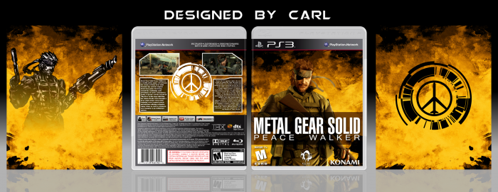
 Metal Gear Solid: Peace Walker Box Cover Comments
Art on back of slipcover by nekozombie66 (deviantart)
Template by sens, scorpion soldier, and deiviuxs
[ Reply ]
I really like the rich color and the overall texture and consistency carried out through. The only thing that I feel like still needs tweaking is the text. It's not very legible—it seems like it's all bolded? And the text is really squished in the right box. It doesn't hurt to read and cut back on text to make it shorter and play with your leading a bit for all the awkward breaks. Can't have all the attention on the images. Text is important too. :)
[ Reply ]
Imho, it isn't the bold look of the text that makes it hard to read, but the size - it's even smaller than the legal text.
[ Reply ]
@Rarity The text seems bolded on the left hand box and it is just about the same size as the legal, which is also a problem. It may also be the settings for the type. @Carlj1497 If you're using photoshop, I'd set the anti-aliasing type to sharp. I don't think you have anything applied, which is causing the text to become illegible due to how harsh the edges are.
[ Reply ]
Nice Box . . .
[ Reply ]
You did it well, Carl ;)
[ Reply ]
Nice
[ Reply ]
Awesome
[ Reply ]
It's good, I like the background texture. Only thing I don't like is the squashed text on the back.
[ Reply ]