you cant just be throwing 5's out like that.
i cant believe your judgement. if you think this is a five, then you ahevnt seen anything and obviously dont know how things work around here.
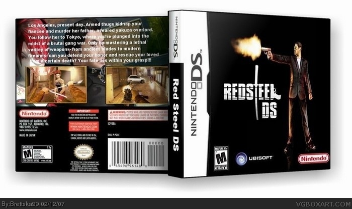
seriously, nintendo logo is too big and oddly positioned, along with being badly cut out, m logo too small, slightly blurry image, boring backgrounds, logo a bit too small, its just too plain, no effort. not a 5.
3.5 at most.
#9 I'm not throwing it about, I like the idea, but what your saying are just a few alterations like logos that can be fixed, but the black background gives it like a scray and dark effect and i like it
#10, sure the idea is okay, but if its something that can be fixed, wait until they fix it---i dont think you get what i'm saying. this isnt a 5. this isnt "awesome". theres hardly any creativity, there obviously wasnt very much effort/time/material put into this at all. look at some real boxes, ones created by those who have been here for a long time, have had boxes on the top ten, put work into it, and know what theyre doing.
i dont know why i'm even caring so much... its not worth my time. you just need to get it straight. this box just does NOT compare.
oh and if somebody could please make this 3D i would be geratful and promise to give credit, if you do just post it in the forum called RedSteel (improvements) please and thank you
I like the front, the text on the back is hard to read and you spelled variety wrong. 3.5/5 but I will change to a 4/5 if you fix the afformentioned problems.
 Red Steel DS Box Cover Comments
I wish this would happen even though i have it for the wii
[ Reply ]
should i submit the back part of this box?
[ Reply ]
Cool box art, I like the idea, and yeah I'd like to see the back
[ Reply ]
#3, ok
[ Reply ]
It way to plain and it needs a ubisoft logo .
I like the Redsteel DS logo .
[ Reply ]
#3, heres the back, i know its not any good but whatever
[ Reply ]
#6 I think it's a good background, though the text is hard to read, maybe bold or chnage colour, other than that the whole things great 5/5
[ Reply ]
its actually a fairly good idea.
can i borrow it?
[ Reply ]
#7, 5/5???!?!!!!!!
you cant just be throwing 5's out like that.
i cant believe your judgement. if you think this is a five, then you ahevnt seen anything and obviously dont know how things work around here.
seriously, nintendo logo is too big and oddly positioned, along with being badly cut out, m logo too small, slightly blurry image, boring backgrounds, logo a bit too small, its just too plain, no effort. not a 5.
3.5 at most.
[ Reply ]
#9 I'm not throwing it about, I like the idea, but what your saying are just a few alterations like logos that can be fixed, but the black background gives it like a scray and dark effect and i like it
[ Reply ]
#9, I argee , this get a 3/5 .
[ Reply ]
#10, sure the idea is okay, but if its something that can be fixed, wait until they fix it---i dont think you get what i'm saying. this isnt a 5. this isnt "awesome". theres hardly any creativity, there obviously wasnt very much effort/time/material put into this at all. look at some real boxes, ones created by those who have been here for a long time, have had boxes on the top ten, put work into it, and know what theyre doing.
i dont know why i'm even caring so much... its not worth my time. you just need to get it straight. this box just does NOT compare.
but seriously
[ Reply ]
#12 ok
[ Reply ]
the front is very plain, and the back isn't good, your luck "D" and "S" are right next to each other in the official logo though ;)
2.5/5
[ Reply ]
has anyone actually read the description yet? (its fairly difficult---but once you make it out LOL)
[ Reply ]
did i mention the dimensions are off as well?
geez, i'm just on a role pointing out everything that wron with this 5/5 box.
[ Reply ]
#16, yeah i guess so, sorry
[ Reply ]
the guy on the front looks like a toy...
[ Reply ]
2/5 Submit to the forums first please. AFTER GOOD REVIEWS, SUBMIT!
[ Reply ]
ok i hope you guys like version 3 a lot more!!! i really worked hard on ver.3
[ Reply ]
oh and if somebody could please make this 3D i would be geratful and promise to give credit, if you do just post it in the forum called RedSteel (improvements) please and thank you
[ Reply ]
credit to petergriff06 for making my dreams possible!
[ Reply ]
I like the front, the text on the back is hard to read and you spelled variety wrong. 3.5/5 but I will change to a 4/5 if you fix the afformentioned problems.
[ Reply ]
#23, if you cant read the text then how'd you know there was a mistake?
[ Reply ]
#23, oh are you working on a box because i crits from people who don't mkae boxes
[ Reply ]