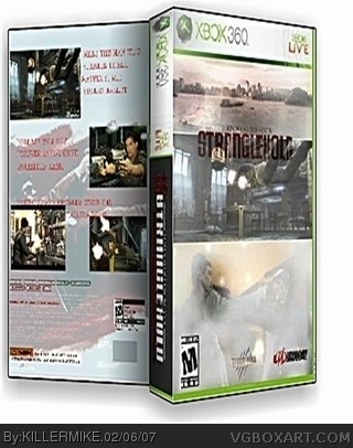
#3, don't submit the back. why? you're going to ask. because its just not good. ESRB, strangle hold logo, and the midway logo are all too small, theres a random city backround (from what it looks like overlayed)overlayed on the pic and logo. it may be your best but it stinks. 1.5/5
#14, I don't this would be my..... 4th post. TECHNICALLY you're spamming your own box because #14 would be your.... 8th post. so please stop being a n00b and make a real box. Have a nice day =D
dont bring his mom into this...and sure this box isnt GREAT...but its not HORRIBLE...a problem with some of the people on this site is a little word called "bias"...if someone like hellknight made a box of this quality (just picked a good boxartist off the top of my head), then you guys would probably rate it descently...but since killermike posted this, you are a lot harsher than you need to be...lighten up people
#22, i know, and neither was I when i started...but he can get better, its something called a "learning curve"...in fact, i bet he WILL get better if we give him advise and he practices
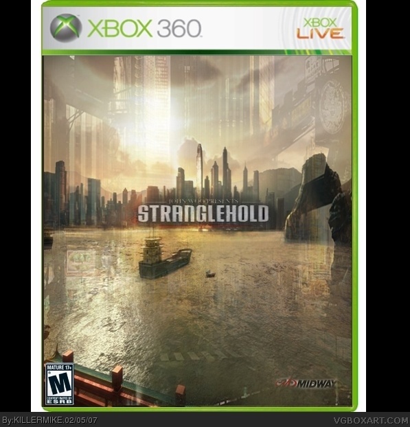
Advise:
1) The ESRB (rating) logo should NEVER touch the bottom, the left, or in this case, both at the same time... position the ESRB so it is like half a centimeter off the bottom off the box, and likewise for the side...
2) Try not to draw attention off the box, for instance, here, you added totally unnecessary black rectangles on each side of the background. Take a look at my boxes and other peoples boxes to see how you should position your box.
3) In MOST cases, the game logo should be centered...now, there are SOME cases where I am wrong, like, Final Fantasy boxes...But for this, center the logo, and make it a tad bigger.
4) The developer logo (Midway) looks like (for lack of a better word) shit. Fix it by enlarging it, and taking off the completely unnecessary lowered opacity. Just, take a midway logo, and add a drop shadow, and resize it, and add it...pretty simple, dev logos dont need too much work.
5) Give credit where credit is due, and if you do not know what I mean, Ill stop being subtle...Credit me for the temp, and whoever else you used material from. Take no shame in crediting people, its being respectful.
6) I may be wrong, but I think I am right....use relevant material...The background you used has no relevance to the game, and in no way shows what the game is about. Go to link link link
for good resources.
I hope I have helped you out
#27, :O someone else that actually gives real advice, instead of just yelling at a person for making a poor box! you're my favorite person on this site.
but yeah killermike you should take his advice i was thinking the same thing.
 Stranglehold Box Cover Comments
HEY ILL SUBMIT THE BACK IN A FEW HOURS
[ Reply ]
please...don't
[ Reply ]
DONT WHAT GOD YOU'RE ANNOYING
[ Reply ]
srry for caps
[ Reply ]
I actually think this is his best but actually cut out the midway logo
[ Reply ]
3.5/5
[ Reply ]
3.5/5?????
WTF THIS BOX IS HARD CORE!!!!!!!!!!
2/5
[ Reply ]
#3, don't submit the back. why? you're going to ask. because its just not good. ESRB, strangle hold logo, and the midway logo are all too small, theres a random city backround (from what it looks like overlayed)overlayed on the pic and logo. it may be your best but it stinks. 1.5/5
[ Reply ]
#8,
[ Reply ]
#8,
[ Reply ]
#8, you're so hating
[ Reply ]
#7, if its hardcore y a 2/5?
[ Reply ]
#11, no I'm honest
[ Reply ]
#8,why do u spam on all my boxes
[ Reply ]
#13, just leave my boxes alond u fu*ker
[ Reply ]
#14, I don't this would be my..... 4th post. TECHNICALLY you're spamming your own box because #14 would be your.... 8th post. so please stop being a n00b and make a real box. Have a nice day =D
[ Reply ]
#16, w/e ni66a
[ Reply ]
#17, Dude you are not black and you suck like your mom,(trust me I know).
[ Reply ]
so not funny im black but i really dont care didnt mean to offend anyone here so srry to u #18
[ Reply ]
#19, Well I am sorry if I offened you because your black but you still suck at this.
[ Reply ]
dont bring his mom into this...and sure this box isnt GREAT...but its not HORRIBLE...a problem with some of the people on this site is a little word called "bias"...if someone like hellknight made a box of this quality (just picked a good boxartist off the top of my head), then you guys would probably rate it descently...but since killermike posted this, you are a lot harsher than you need to be...lighten up people
[ Reply ]
#21, Fine I will lighten up on him but you have to admit he isnt that good at this.
[ Reply ]
#21, thanks that really is the truth preach
[ Reply ]
#22, i know, and neither was I when i started...but he can get better, its something called a "learning curve"...in fact, i bet he WILL get better if we give him advise and he practices
[ Reply ]
#12 I was sarcastic ya stupid troll. Your a n00b, not a newb.:P
*ask RB what the difference is*
1.5/5
[ Reply ]
...it's better...
But, i'm glad you only used CAPS once. :)
Now if we could just get a proper sentence...
[ Reply ]
Advise:
1) The ESRB (rating) logo should NEVER touch the bottom, the left, or in this case, both at the same time... position the ESRB so it is like half a centimeter off the bottom off the box, and likewise for the side...
2) Try not to draw attention off the box, for instance, here, you added totally unnecessary black rectangles on each side of the background. Take a look at my boxes and other peoples boxes to see how you should position your box.
3) In MOST cases, the game logo should be centered...now, there are SOME cases where I am wrong, like, Final Fantasy boxes...But for this, center the logo, and make it a tad bigger.
4) The developer logo (Midway) looks like (for lack of a better word) shit. Fix it by enlarging it, and taking off the completely unnecessary lowered opacity. Just, take a midway logo, and add a drop shadow, and resize it, and add it...pretty simple, dev logos dont need too much work.
5) Give credit where credit is due, and if you do not know what I mean, Ill stop being subtle...Credit me for the temp, and whoever else you used material from. Take no shame in crediting people, its being respectful.
6) I may be wrong, but I think I am right....use relevant material...The background you used has no relevance to the game, and in no way shows what the game is about. Go to link
link
link
for good resources.
I hope I have helped you out
[ Reply ]
#27, :O someone else that actually gives real advice, instead of just yelling at a person for making a poor box! you're my favorite person on this site.
but yeah killermike you should take his advice i was thinking the same thing.
[ Reply ]
aw man gamewallpapers is so gay. you have to sign up, sure thats fine but you HAVE TO PAY!!??!!!11?!!exclamation mark!!1?
[ Reply ]
#28, i will thanks crayon man big help!
[ Reply ]
i think i found the official boxart link
[ Reply ]
oh god it looks even worse now!!!!
[ Reply ]