![]() »
»
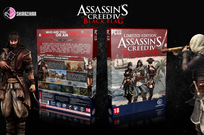
See Full Size : 4800*3200
I need to thanks MattStar for giving me some idea to design this cover .
Logo : link
Render : link - link - link - link - link - link
[ Box updated on November 27th, 2013 ] [ original ]
 Assassins Creed IV: Black Flag Box Cover Comments
Comment on shirazihaa's Assassins Creed IV: Black Flag Box Art / Cover.
Really Great & Appealing . . .
[ Reply ]
Yeah it was really hard,Thanks for your comment ;)
[ Reply ]
Just woow...
[ Reply ]
Thanks Payam ;)
[ Reply ]
nice work :D
[ Reply ]
Thanks Edward ;)
[ Reply ]
wow
[ Reply ]
Please add printable
[ Reply ]
WoW! The Best AC IV cover :D
[ Reply ]
Thanks Brother . printable soon ...
[ Reply ]
Real Deal! nice on.
[ Reply ]
thanks
[ Reply ]
Nice. Although the red, white and blue thing doesnt really work here. This is a pirate game. Which, when I think of a pirate, is the black and white flag of the skull on it.
[ Reply ]
ok . thanks brother ;)
[ Reply ]
Yeah I think I agree. These colours are better suited to AC3.
[ Reply ]
@Joeseye yeah , Thanks ;)
[ Reply ]
Very nice cover. Only thing need to attention is red texts on red backgrounds on back and from of cover. :D
[ Reply ]
exactly right majid . thanks for comment ;)
[ Reply ]
I personally really like some of your ideas, but I must say that the colour scheme just doesn't really do it for me. It seems as if you've had a good idea with the red, white and blue, but visually it just doesn't work for me, personally.
There are several small 'flaws' that I noticed, such as the white part above the palm-trees on the front, for instance..(The brush used to blend the red into the background isn't very clean)
Some of the backgrounds really disrupt the flow of the cover. The sea is a bit harsh in contrast to the smooth and flowing red and blue portions. The character-renders also seem to have different lighting than the ones next to them, which makes it seem a bit odd and out-of-place.
Overall, I really love the ideas you've thought of and it's apparent that you have a good eye for these kinds of things.
However, there are still a couple of small flaws that really result in the fact that the box doesn't have the ''oompf'' the rest of your boxes have.
[ Reply ]
ommmmmmmmmm . yeah . thanks for comment ;)
[ Reply ]
Congrats Amin . . .
[ Reply ]
Thanks Matin ;)
[ Reply ]
Congrats brother that's well deserved :)
[ Reply ]