![]() »
»
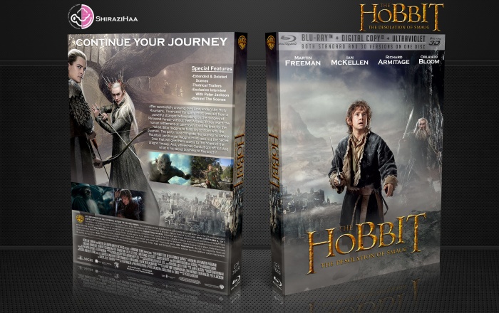
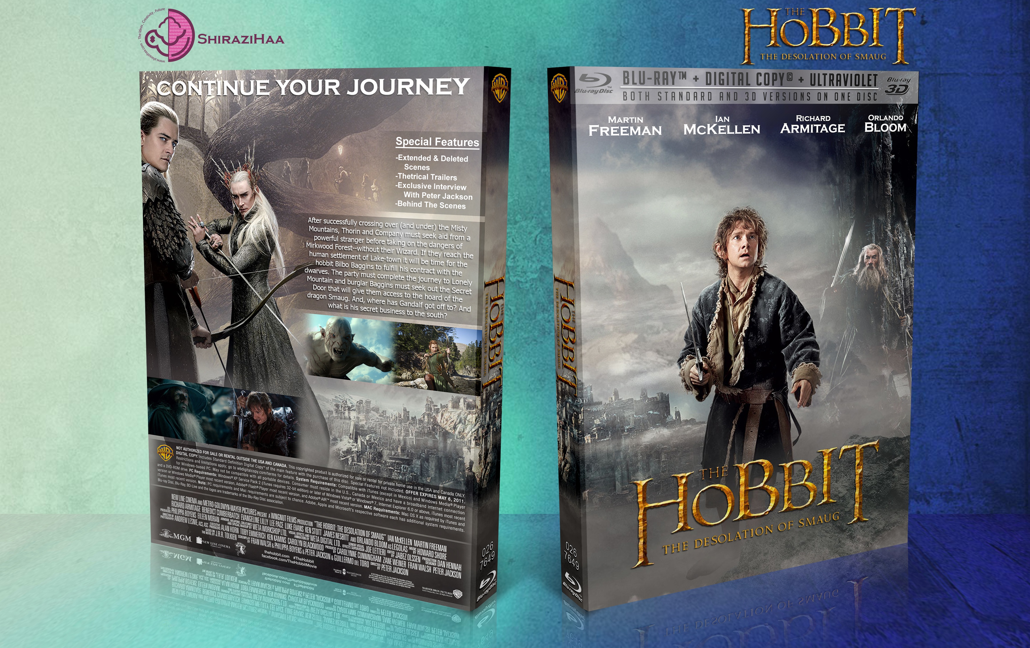
See Full Size : 3500*2204
Logo :
link
[ Box updated on November 2nd, 2013 ] [ original ]
 The Hobbit: The Desolation of Smaug Box Cover Comments
Comment on shirazihaa's The Hobbit: The Desolation of Smaug Box Art / Cover.
I really love how you present your covers. They look very very official, and I took a lot of inspiration from your layout for my most recent Thor: The Dark World cover :)
[ Reply ]
Thanks ;-)
[ Reply ]
I like it, but I feel like the amount of dead space created due to the placement of the special features box kind of irks me. I wish you'd made that part longer horizontally and broken it down to a 2x2 horizontally narrow box instead.
[ Reply ]
Thanks , that was a nice idea ;-)
[ Reply ]
nice men
[ Reply ]
Looks Great . . .
[ Reply ]
thanks brother
[ Reply ]