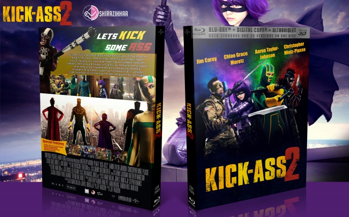
Neat-O. Just some nit-picks, I think the yellow background to the body text on the back could've been a little more splat-y rather than blobby, The header text on the back coulda done with a different font and some grungy features too, it might have fit a little better with the theme. You probably could have kept Colonel Stars & Stripes flipped the other way, I think it mighta given it a better composition and the american flag is backwards there haha. I also see some weirdddd thing(?) repeating at the bottom of the front under/behind the logo. Those are just small things though it looks great regardless!
 Kick-Ass 2 Box Cover Comments
Nice . . .
[ Reply ]
I think the top of the front could have a better font.
[ Reply ]
Neat-O. Just some nit-picks, I think the yellow background to the body text on the back could've been a little more splat-y rather than blobby, The header text on the back coulda done with a different font and some grungy features too, it might have fit a little better with the theme. You probably could have kept Colonel Stars & Stripes flipped the other way, I think it mighta given it a better composition and the american flag is backwards there haha. I also see some weirdddd thing(?) repeating at the bottom of the front under/behind the logo. Those are just small things though it looks great regardless!
[ Reply ]