I think what aldimon means it that fact there isn't a "wow" factor in here. It's a nicely done box and I always appreciate how clean and well-put your work is, since I know you're aiming for an official look most of the time. I guess in a sense, it would be nice for you to try a different approach and to get out of your comfort zone. Basically try something you have not done before in terms of style and not subject matter and basically challenge yourself more as a maker. I have a similiar dilemma myself, since I like an official look myself, but at the same time I like to try new things whenever I make a box.
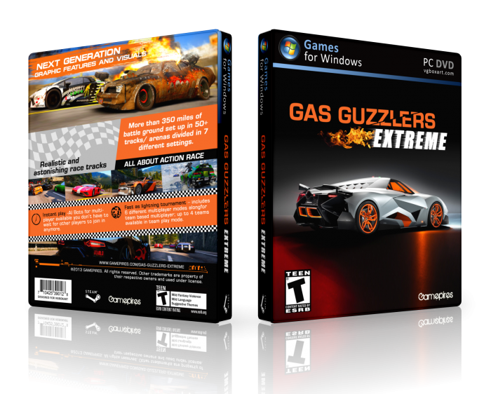
Anyway, I like how this box turned out. I see you made the logo, which is an alright logo, though the treatment for "Guzzlers" doesn't make sense to me. The front is a little too simple for me and I would like to see something a little more dynamic happening there, since the back is quite dynamic with the diagonals and screenshots you've used. Anyway, great job with the back and good job with the front. :)
 Gas Guzzlers Extreme Box Cover Comments
Kinda an Old formula..
[ Reply ]
Don't get me wrong, It's good, but that's Nothing new. Maybe experiment with your covers a Little bit more.
[ Reply ]
@aldimon Maybe but logo made by me. and structure diffrent with old my formula truck. However, I hope it is good.
[ Reply ]
Like
[ Reply ]
Nice,Like Front . . .
[ Reply ]
Nice
[ Reply ]
I think what aldimon means it that fact there isn't a "wow" factor in here. It's a nicely done box and I always appreciate how clean and well-put your work is, since I know you're aiming for an official look most of the time. I guess in a sense, it would be nice for you to try a different approach and to get out of your comfort zone. Basically try something you have not done before in terms of style and not subject matter and basically challenge yourself more as a maker. I have a similiar dilemma myself, since I like an official look myself, but at the same time I like to try new things whenever I make a box.
Anyway, I like how this box turned out. I see you made the logo, which is an alright logo, though the treatment for "Guzzlers" doesn't make sense to me. The front is a little too simple for me and I would like to see something a little more dynamic happening there, since the back is quite dynamic with the diagonals and screenshots you've used. Anyway, great job with the back and good job with the front. :)
[ Reply ]
Appreciated a lot sis,
I know what aldimon says. OK, I will try harder.
[ Reply ]
Welcome to Red.
[ Reply ]
Thank You :D
[ Reply ]
@LastLight Congrats Red Level . . .
[ Reply ]
@matingsm Thanks Matin.
[ Reply ]
plz printable
[ Reply ]