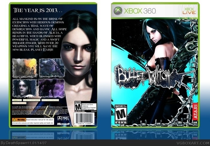
[ Buy Bulletwitch at Amazon ] By DeathSpawn11 47 on January 13th, 2007 No Printable Available [ Box updated on January 14th, 2007 ] [ original ] Bulletwitch Box Cover Comments Comment on DeathSpawn11's Bulletwitch Box Art / Cover. Cancel Reply DeathSpawn11 47 [ 1 decade ago ] I finally finished it please rate and comment [ Reply ] lord_arcanus 20 [ 1 decade ago ] i was just about to pm you that atari logo. sorry i forgot about it. this is really great deathspawn i dont think theres anything wrong with this 5/5 [ Reply ] Radioactive Bob 38 [ 1 decade ago ] This is great. However, I think the front is a little too colorful, and the screens on the back could be moved down so they don't block part of the girls face. [ Reply ] Ninjamojo27 37 [ 1 decade ago ] This box is really cool 5/5. The only thing I personally dont like about it that light blueish color on the front. [ Reply ] E_G 39 [ 1 decade ago ] I really like what DeathSpawn has done with the front, really stylish and unclichéd. This is so clean and pretty I have to give it 5/5. [ Reply ] Ratchetcomand 8 [ 1 decade ago ] fantastic! 4.5/5 [ Reply ] finalfantaseer22 43 [ 1 decade ago ] this is great, but personally i dont like the bright blue and the black is a little plain 4.5/5 plus, i like mine better hehe ;P [ Reply ] finalfantaseer22 43 [ 1 decade ago ] #7, back* [ Reply ] DeathSpawn11 47 [ 1 decade ago ] almost forgot credit to crayon man for the 360 template. also thx for all the comments everybody. [ Reply ] Gunslinger 42 [ 1 decade ago ] I'm not too crazy about the back as it seems a bit too symetrical to me but the front is top notch. Nice job overall. [ Reply ] Ratchetcomand 8 [ 1 decade ago ] This number 3 now on the Highest Rated list! [ Reply ] Ninjamojo27 37 [ 1 decade ago ] Well it isnt anymore. I wonder why... [ Reply ] Ratchetcomand 8 [ 1 decade ago ] #12, I wounder why as well . [ Reply ] DeathSpawn11 47 [ 1 decade ago ] K I updated it. I lowered the pics and placed the top right pic behind the girls face. I also lowered the text so there wouldn't be a giant gap. [ Reply ] Ninjamojo27 37 [ 1 decade ago ] It looks like the top right picture is being drived into her neck lol. But it is still good. [ Reply ]
 Bulletwitch Box Cover Comments
I finally finished it please rate and comment
[ Reply ]
i was just about to pm you that atari logo. sorry i forgot about it.
this is really great deathspawn i dont think theres anything wrong with this
5/5
[ Reply ]
This is great. However, I think the front is a little too colorful, and the screens on the back could be moved down so they don't block part of the girls face.
[ Reply ]
This box is really cool 5/5. The only thing I personally dont like about it that light blueish color on the front.
[ Reply ]
I really like what DeathSpawn has done with the front, really stylish and unclichéd.
This is so clean and pretty I have to give it 5/5.
[ Reply ]
fantastic! 4.5/5
[ Reply ]
this is great, but personally i dont like the bright blue and the black is a little plain 4.5/5
plus, i like mine better hehe ;P
[ Reply ]
#7, back*
[ Reply ]
almost forgot credit to crayon man for the 360 template. also thx for all the comments everybody.
[ Reply ]
I'm not too crazy about the back as it seems a bit too symetrical to me but the front is top notch. Nice job overall.
[ Reply ]
This number 3 now on the Highest Rated list!
[ Reply ]
Well it isnt anymore. I wonder why...
[ Reply ]
#12, I wounder why as well .
[ Reply ]
K I updated it. I lowered the pics and placed the top right pic behind the girls face. I also lowered the text so there wouldn't be a giant gap.
[ Reply ]
It looks like the top right picture is being drived into her neck lol. But it is still good.
[ Reply ]