![]() »
»
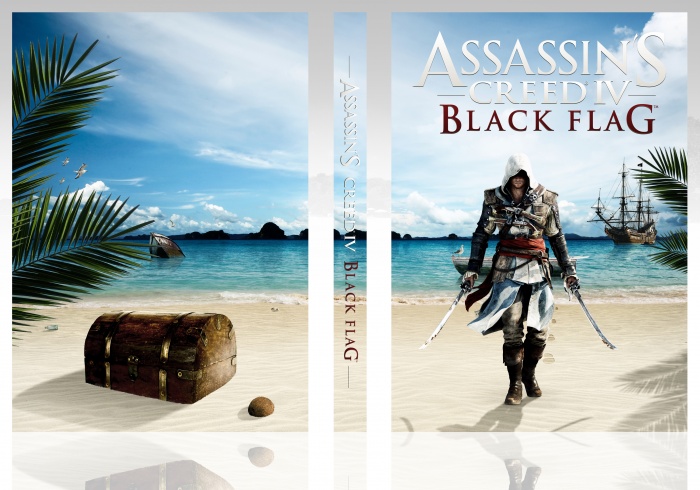
PLEASE VIEW IN FULL SIZE!
This is a combination of a sky, ocean, sand, boat, ship, the footprints, seagulls, leaves... all that stuff. I've added the shadows and reflexion as well myself, ajusted the lightning and other effects...
It's a non logo editon, the logo ruins it all. But i have the game's name logo of course.
I've spent tons of time working on this little project, i hope you guys like. :D
 Assassin's Creed IV: Black Flag Box Cover Comments
Comment on White Wolf's Assassin's Creed IV: Black Flag Box Art / Cover.
If you can't see this in full size, refresh it till it works. :D
[ Reply ]
Loving it.
[ Reply ]
Very interesting. Amazing job, as usual.
[ Reply ]
Wo0o0o0w,Really Awesome,I was surprised See Full Size . . .
[ Reply ]
nice brother . like
[ Reply ]
like it
[ Reply ]
Yeah , nice , Tones of time on a great project :")
[ Reply ]
Love it.
[ Reply ]
Secrets hidden within the cover
[ Reply ]
Nice work!
[ Reply ]
Really nice !
[ Reply ]
Really nice!! LOVE this!!!
[ Reply ]
Love it. The effort is clearly visible.
[ Reply ]
Nice idea, good work, but imperfect in my eyes. :D Lots of the stuff looks pasted (treasure chest hasn't got enough sand on it. Come on, ey, there's got to be some sand from the wind or else?) Sand looks too flat. There should be carvings in the sand for all the objects (hero, chest, coconut). Shadow of the back objects seem to differ a bit from the one used on the main character.
I do however see the enormous effort. The "lack" of logo is nice, though I would have liked something more on the back. Like a tiny tagline. Tiny. Like "Go fish." or something in very small letters.
Like the colours, too. Has a nice carribean feel to it. :)
[ Reply ]
Congrats
[ Reply ]
Congrats Man,Where are you Bro!?
[ Reply ]
Not too bad, but shadows is not perfect and back cover is to empty form me. Maybe you add to screen, synopsis an logos to back? It's very simple cover. I'm sorry but his is not cover for hall of fame for me. I see many highest cover in this site. Half of fame is very poor in this site.
[ Reply ]
Best cover made from scratch.I see that it took a lot of effort.
[ Reply ]
Congrats on Hall! Great design.
[ Reply ]