I would've preferred it better if you displayed the logo like this link
rather than it being transparent, and you missed the
companies which would probably be Shiny and Atari too, but not a bad job anyway.
3.5/5.
now theres a little too many logos at the bottom.
the teen logo is too close to teh edge. and the nitendo seal is somewhat unecessary.
you could probably do without the shiny entertainment logo, too.

 The Matrix: Reborn Box Cover Comments
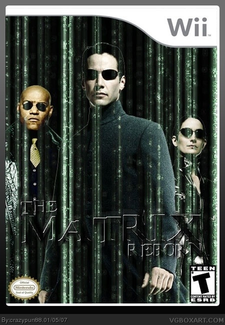
Another one by me ^_^...hope you like it
[ Reply ]
I would've preferred it better if you displayed the logo like this link
rather than it being transparent, and you missed the
companies which would probably be Shiny and Atari too, but not a bad job anyway.
3.5/5.
[ Reply ]
oops...completely forgot about the companies lol...ill update it soon
[ Reply ]
#3, Ok, I may revote too.
[ Reply ]
there we go...updated the box with the company logos and changed the matrix logo. Thanks Electric General for pointing thos out. ^_^
[ Reply ]
I really like this, but the dev logos are a bit blurry. 4/5
[ Reply ]
now theres a little too many logos at the bottom.
the teen logo is too close to teh edge. and the nitendo seal is somewhat unecessary.
you could probably do without the shiny entertainment logo, too.
[ Reply ]
UPDATED AGAIN! lol
Thanks for all the comments and suggestions =D
[ Reply ]
Great changes.
4.5/5.
[ Reply ]
This is great 4.5/5
[ Reply ]
matrix is awesome!
[ Reply ]
#11, Needlessly bumping old boxes is not.
[ Reply ]