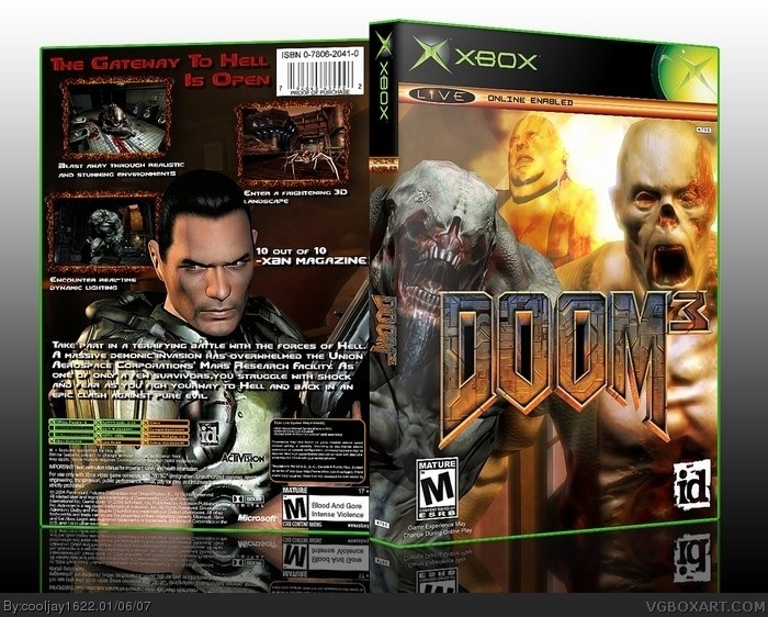
[ Buy Doom 3 at Amazon ] By cooljay1622 37 on January 4th, 2007 No Printable Available [ Box updated on January 6th, 2007 ] [ original ] Doom 3 Box Cover Comments Comment on cooljay1622's Doom 3 Box Art / Cover. Cancel Reply cooljay1622 37 [ 1 decade ago ] I didnt know what i should do next so i did doom3 and thanks to radioactive bob for the suggestion:) [ Reply ] Ratchetcomand 8 [ 1 decade ago ] This is very nice 4.5/5 . [ Reply ] lord_arcanus 20 [ 1 decade ago ] f*cking awesome. 4.5/5 [ Reply ] Radioactive Bob 38 [ 1 decade ago ] This is VERY nice. But a few problems. 1) The slogan on the back is a little hard to read. 2) The back itself is pretty cramped. 4.5/5 though. [ Reply ] cooljay1622 37 [ 1 decade ago ] #4 the the slogan looks bright when i view it on my computer but here it looks darker is there any way i can fix that? and thanks [ Reply ] Radioactive Bob 38 [ 1 decade ago ] #5, just a few drop-shadows should make it more visible. [ Reply ] Darthspazz 4 [ 1 decade ago ] Very good! 4.5/5 [ Reply ] Maybe Tomorrow 30 [ 1 decade ago ] Logo on front isnt fully cut out. There's someblack in the DOO. [ Reply ] Hunter 3 [ 1 decade ago ] use *inner glow * on the slogan and site the optic to %40 or %67 and make the cooler white , it should do the trick [ Reply ] cooljay1622 37 [ 1 decade ago ] radioactive bob the back was pretty cramped so i fixed that and moved slogan to a different area so you can see it better [ Reply ] Radioactive Bob 38 [ 1 decade ago ] This is much, much better. I'd go with a 5/5, this is very nice. :) [ Reply ] cooljay1622 37 [ 1 decade ago ] thanks [ Reply ] Vekta101 33 [ 1 decade ago ] Loving this. Not only does it look good but it's not just a rip off of the original cover. Good work. [ Reply ]
 Doom 3 Box Cover Comments
I didnt know what i should do next so i did doom3
and thanks to radioactive bob for the suggestion:)
[ Reply ]
This is very nice 4.5/5 .
[ Reply ]
f*cking awesome.
4.5/5
[ Reply ]
This is VERY nice. But a few problems.
1) The slogan on the back is a little hard to read.
2) The back itself is pretty cramped.
4.5/5 though.
[ Reply ]
#4 the the slogan looks bright when i view it on my computer but here it looks darker is there any way i can fix that?
and thanks
[ Reply ]
#5, just a few drop-shadows should make it more visible.
[ Reply ]
Very good! 4.5/5
[ Reply ]
Logo on front isnt fully cut out. There's someblack in the DOO.
[ Reply ]
use *inner glow * on the slogan and site the optic to %40 or %67 and make the cooler white , it should do the trick
[ Reply ]
radioactive bob the back was pretty cramped so i fixed that and moved slogan to a different area so you can see it better
[ Reply ]
This is much, much better. I'd go with a 5/5, this is very nice. :)
[ Reply ]
thanks
[ Reply ]
Loving this. Not only does it look good but it's not just a rip off of the original cover. Good work.
[ Reply ]