![]() »
»
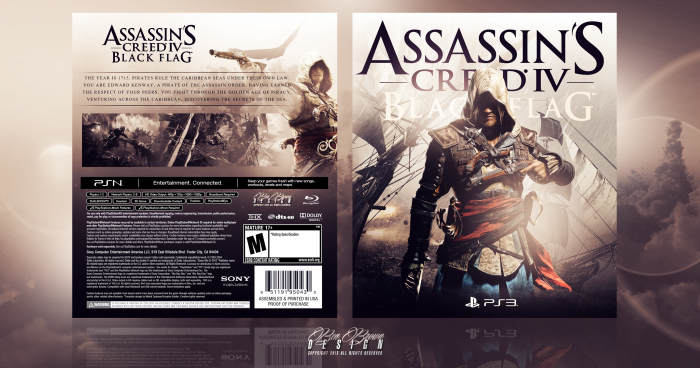
A PS3 cover I designed for Assassin's Creed IV: Black Flag.
After browsing around the site and checking out different presentation styles, I've really taken a liking to 2D rather than the usual 3D you see elsewhere.
I had a bit of trouble with the back on this and didn't want to put a downer on the whole cover against my front which I think is the highlight, despite an embarrassing error in the bottom right with an image watermark from the original source that I've now changed on the full cover, but I think I just scraped through it on the back.
Presentation wise, I have to give credit to aldimon. I was looking through your gallery and loved your 2D presentation, so I did the same; I hope you don't mind.
I also added a simple PS3 logo on my cover like you've done some of yours, too. I really liked the simplicity of that apposed to using up unnecessary room using a full game template.
Anyway, enough rambling; cheers for looking :)
 Assassin's Creed IV: Black Flag Box Cover Comments
Comment on BenBrownDesign's Assassin's Creed IV: Black Flag Box Art / Cover.
Nice, I am really not a fan of designs where the design covers the logo up too much, in this case I think it is way overdone, maybe shrink him a bit so just the tip of his head overs the k in black. or something, but other than that its nice. :)
[ Reply ]
Cheers mate. I know what you mean, too. I'm normally the same, but I thought that because Assassin's Creed is such a popular series now that, if this were in store or something, people would recognise it anyway.
I'll give what you recommended a bash :)
[ Reply ]
Jaw Dropping!
[ Reply ]
Thanks, that means a lot :)
[ Reply ]
very nice...i love color.
[ Reply ]
Thanks mate.
I had a bit of trouble getting a final colour. It was almost a more black/white version, but I liked the warm colours a bit more.
[ Reply ]
Back could have used a tagline, and the "Black Flag" part should be a darker color. Good otherwise.
[ Reply ]
Ah, I didn't think of a tagline. Good call.
Perhaps: "Fighting like a devil, dressed as a man" from the official?
[ Reply ]
@BenBrownDesign sounds good.
[ Reply ]
Yeah Nice Bro,Like Color & Front . . .
[ Reply ]
Thanks a lot mate :)
[ Reply ]
Great work.
[ Reply ]
Thank you :)
[ Reply ]
Love color effecting , U did a great job ,:")
[ Reply ]
Thanks mate, appreciate it!
[ Reply ]
As if I mind. Turned out great.
Only thing bugging me is that the subtitle is not really visible, you should have found another way to implement it; but the rest is really really beautiful.
[ Reply ]
Thanks a lot, I really appreciate it :)!
I'll try to revise the tagline, also.
[ Reply ]
Nice my brother . Amazing Design
[ Reply ]
Thank you mate :)
[ Reply ]
I love the design and the restraint you have shown in it, the mark of a true professional. My only gripe is that I think it's a little too monochromatic, on the back more than the front. Nothing on the back really grabs my attention and I think a few splashes of colour (even saturated colour) would make a world of difference.
Beautiful though, regardless of that.
[ Reply ]
I see what you mean, actually. When I desaturated the first screenshot I thought it was kind of dull, but I was more worried about making it stand out too much against the rest of the cover.
Thanks, too. I appreciate it :)
[ Reply ]
Superbe colours, fantastic simplistic details. Love it!
[ Reply ]
Thank you mate, I really appreciate it! :)
[ Reply ]
I agree with tomB, about the render covering up the logo a bit to much. The 'Black Flag' part could use a light drop shadow. I personally don't really like the fact that the AC Black Flag logo re-appears on the back, it's quite unnecessary to be honest (a tagline would fit so much better at that place) I do get what you tried to achieve with the screenshots, but they would look better with a bit more color imo.
Other than these things, I really like this.
[ Reply ]
Thanks for the feedback mate, I really appreciate it.
Like I said earlier, I was more worried about making the screenshots stand out too much against the rest of the cover so I kept them the same kind of colours.
[ Reply ]
I agree with tomB and Bastart.
But still it's a great work.
[ Reply ]
Thank you, I appreciate it :)
[ Reply ]
amazig
[ Reply ]
Thanks buddy, glad you like it :) appreciate the comment!
[ Reply ]
Congrats Man
[ Reply ]
Thank you very much!
I feel very honoured to say the least.
[ Reply ]
Congrats Ben
[ Reply ]
Congrats, That's well deserved.
[ Reply ]
Congrats man, well deserved
[ Reply ]
I love the colour tones and contrast. Consistent, too!
[ Reply ]
Congrats on the HoF! This is very nice. I'm surprised I missed it earlier. :)
[ Reply ]