[ Buy SSX Blur at Amazon ] By DeathSpawn11 47 on December 31st, 2006 No Printable Available SSX Blur Box Cover Comments Comment on DeathSpawn11's SSX Blur Box Art / Cover. Cancel Reply Radioactive Bob 38 [ 1 decade ago ] Very nice. The front is sharp and well done, and the back is great. yet it is hard to read the text and feels empty at spots. [ Reply ] DeathSpawn11 47 [ 1 decade ago ] thx mikey :D anyway I worked pretty hard on this taking advantage of CS2 which helped me make the screenies the way they are so cred to that site. [ Reply ] finalfantaseer22 43 [ 1 decade ago ] awesome cover, yet i actually dont like the way the screenies are. and text is a little hard to read. maybe... white text with black stroke instead? i dunno oh and nintendos on the bacl twice. [ Reply ] Ricardo 24 [ 1 decade ago ] Really like the front part of the box, and the logo. Only Problem is that the text on the back is hard to read and it looks a little empty on the back. [ Reply ] DeathSpawn11 47 [ 1 decade ago ] #4, thx dude I'm most likely gonna add am few more drop shadows to the text. not sure what I should do with the back. and #3, I'll fix the two ninty logos on the back by taking out one and replacing it with an EA logo [ Reply ] Sergant Johnson 38 [ 1 decade ago ] #5, came out pretty kool deathspawn.....it came out pretty kool. 4.5/5 keep up the good work [ Reply ] Tucker1140 23 [ 1 decade ago ] Pretty cool but the game is boring! [ Reply ]
 SSX Blur Box Cover Comments
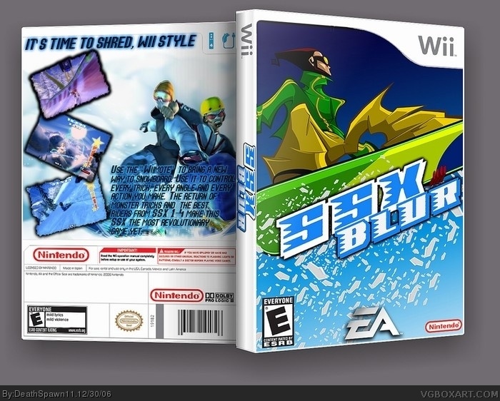
Very nice. The front is sharp and well done, and the back is great. yet it is hard to read the text and feels empty at spots.
[ Reply ]
thx mikey :D
anyway I worked pretty hard on this taking advantage of CS2 which helped me make the screenies the way they are so cred to that site.
[ Reply ]
awesome cover, yet i actually dont like the way the screenies are.
and text is a little hard to read.
maybe... white text with black stroke instead?
i dunno
oh and nintendos on the bacl twice.
[ Reply ]
Really like the front part of the box, and the logo. Only Problem is that the text on the back is hard to read and it looks a little empty on the back.
[ Reply ]
#4, thx dude I'm most likely gonna add am few more drop shadows to the text. not sure what I should do with the back.
and #3, I'll fix the two ninty logos on the back by taking out one and replacing it with an EA logo
[ Reply ]
#5, came out pretty kool deathspawn.....it came out pretty kool. 4.5/5 keep up the good work
[ Reply ]
Pretty cool but the game is boring!
[ Reply ]