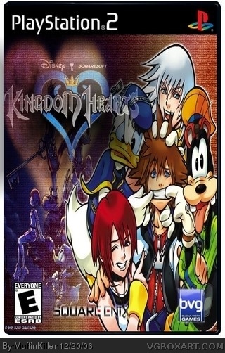
1: Don't make your logos transparent to hide bad or nonexistent cutting jobs. That applies to the Square and BVG logos, I can't even tell with the KH logo.
2: Remove the copyright at the bottom and give credit.
3: Nice temp, good quality box over all.
4: Pic seems too lighthearted compared to faded pic.
3/5, I guess.
#2, well I understand were your coming from but I don;t have gimp anymore so I use picture it and I just faded the logo a bit and put two wallpapers together because I thought it'd make a good box.
 Kingdom Hearts Box Cover Comments
Haven't submitted a box in awhile don't be to hard 'snif sniff' jks.
[ Reply ]
1: Don't make your logos transparent to hide bad or nonexistent cutting jobs. That applies to the Square and BVG logos, I can't even tell with the KH logo.
2: Remove the copyright at the bottom and give credit.
3: Nice temp, good quality box over all.
4: Pic seems too lighthearted compared to faded pic.
3/5, I guess.
[ Reply ]
#2, well I understand were your coming from but I don;t have gimp anymore so I use picture it and I just faded the logo a bit and put two wallpapers together because I thought it'd make a good box.
[ Reply ]
Well now that you expose your lack of effort, that almost wants to make me bring my score down.....
AND WHY NOT USE GIMP?
[ Reply ]
I don't know who to give credit too though?
[ Reply ]
Thats really not good.
You shouldn't use their art then.
[ Reply ]
Hang on I'll fix it.
[ Reply ]
It a improvment but it still more work
1. Remove BVG logo with a Disney interactive logo
2. Remove the Squre enix logo with a squresoft logo
3. Give Credit to Crayon Man for his temp .
2.5/5
[ Reply ]
i saw this image on google.
[ Reply ]
#9, Google is used by many, many people. I don't find a problem with that. Heck. I even use it.
[ Reply ]
#10, shuddup. of course you use it.
stop thinking youre special.
yeah this box probably wouldnt be half bad if it wasnt so freakin smooshed goodness.
[ Reply ]
Its too smooshed... The picture wouldn't be official and I don't like the transparent logos. 3/5
[ Reply ]