Hey, no problem. Try to improve and listen to criticism, and don't antagonize critics. Then you'll do good on this site.
So, let's get down to business.
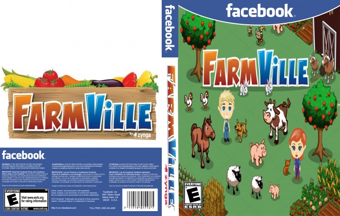
The picture on the front is distorted. You should always try to keep the proportions, if you don't it'll end up looking bad.
The Logo on the spine is heavily distorted as well. Keep the proportions, that would do a big job.
The back is empty, lacks a background, a description and screenshots. I would suggest to you that you should focus on fronts first and do backs when you're a little experienced with fronts, as backs are easily to ruin.
Next time, give credits for the template.
To add to aldimon's comment: To keep things in proportion, you should scale objects down while holding the shift-key on your keyboard. Also never scale images up, it gets distorted heavily when you do that.
It's not a bad concept. but needs some work.
A summary and headline of some kind would work well for a more official look, as well as the zynga logo somewhere on the back (maybe next to facebook) and the front (bottom right corner). You can also bring the green of the grass to the back for more of a cohesive look.
If you want, for any future boxes, there is a WIP thread in the forums where you can get ideas and help as you're working and that way submit something more completed.
 Farmville Box Cover Comments
It's My First One So It Isn't That Good.
[ Reply ]
Hey, no problem. Try to improve and listen to criticism, and don't antagonize critics. Then you'll do good on this site.
So, let's get down to business.
The picture on the front is distorted. You should always try to keep the proportions, if you don't it'll end up looking bad.
The Logo on the spine is heavily distorted as well. Keep the proportions, that would do a big job.
The back is empty, lacks a background, a description and screenshots. I would suggest to you that you should focus on fronts first and do backs when you're a little experienced with fronts, as backs are easily to ruin.
Next time, give credits for the template.
Good day to you, sir.
[ Reply ]
To add to aldimon's comment: To keep things in proportion, you should scale objects down while holding the shift-key on your keyboard. Also never scale images up, it gets distorted heavily when you do that.
It's not a bad concept. but needs some work.
A summary and headline of some kind would work well for a more official look, as well as the zynga logo somewhere on the back (maybe next to facebook) and the front (bottom right corner). You can also bring the green of the grass to the back for more of a cohesive look.
If you want, for any future boxes, there is a WIP thread in the forums where you can get ideas and help as you're working and that way submit something more completed.
[ Reply ]
fuck yeah lucidhalos, giving constructive crticism is so fun!
[ Reply ]
the back needs more renders and a background, and the front is strectched. you should find a bigger picture and crop it
[ Reply ]